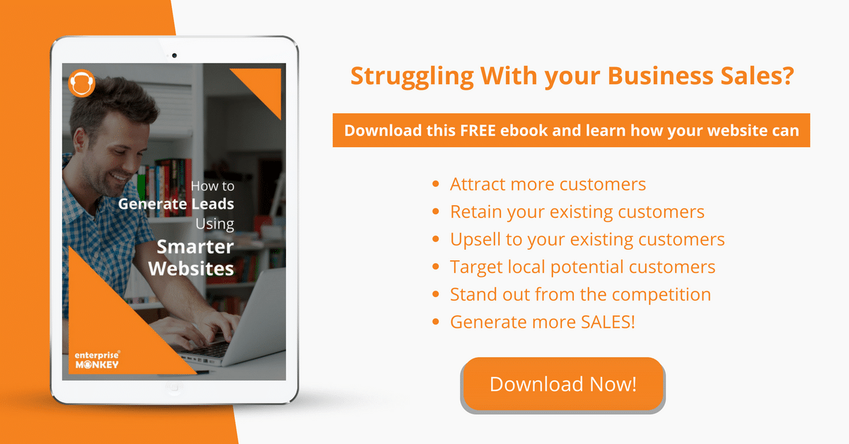


According to Gartner’s annual survey, enterprise companies continue to invest humongous amounts in digital marketing. And why wouldn’t they? After all, a website amounts to the maximum of the digital presence of a company. In a world dominated by devices, digital presence becomes crucial. A popular site almost directly equates to raging profit and revenue.
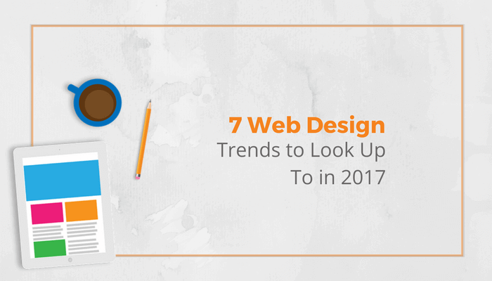
Halfway through 2017 and web designers have already flooded the market with fresh and innovative designs. Web designing companies are in a constant struggle to innovate and update their workforce. Moreover, Blogs suggesting ways renovate your website to up your game have flooded the internet. But how to do that? How to Upgrade your site to its highest potential. The first step – Update to Upgrade
Following trends is in vogue, and the same mantra applies to web designing. But this doesn’t mean that you have to be just another sheep in the flock. Be the black sheep and stand out in the digital universe. Know what to keep and what to drop. A trendy and up-to-date website design will contribute to generating leads, but you need to be careful with what you pick for your site.
According to an article in The Atlantic ‘By 2014, there were more than 1 billion websites online’ but ‘Most internet sites die after a couple of months.’ So, just putting it up, won’t do for your business. You need to invest time as well as money to turn it into a racing horse.
We understand the pain of surfing through numerous links to find the latest web design trends. Besides that, you also need to flush out those that are not genuine. To get you through this tiring task in a matter of minutes we have done the work for you!
Here are seven read, researched and shortlisted web design trends that you need to know about, this year.
1. Geometrical Shapes and Patterns
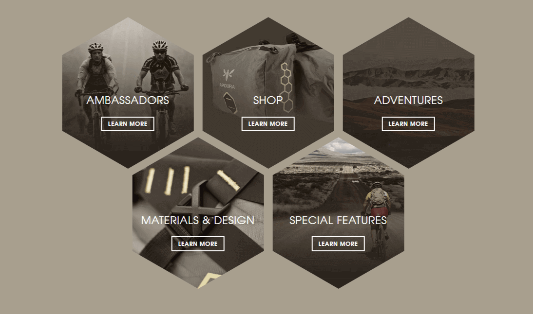
From the standard grid to the regular rectangular button, these shapes have always dominated website interfaces. The trend that is currently doing its rounds is a similar spin-off. Geometrical patterns are used as rickety decorations and also for breaking the norm of traditional web design techniques. Shapes can be used to add the element of drama and dynamics to the background. From the mysticism of a circle to the vivacity of a rhombus, each shape adds a different dynamic hue when used creatively.
Geometrical shapes as Decorations, extensive backgrounds, creative segregation, subtle buttons, etc. are quite visible.
Apidura, an e-commerce site uses this feature with an elegant twist.
2. GIF/Other Animations
Have you ever tried to walk by a turned on TV set without flashing a glance? Had trouble turning away? That’s because our brain is wired to focus on moving objects over static ones.Website visitor psychology is an important aspect of web designing.
According to an article in The Telegraph, Human attention span has been reduced to less than that of a goldfish. Understanding these exigencies, web designers have come up with a new idea to grab that attention we are so eager to divert.
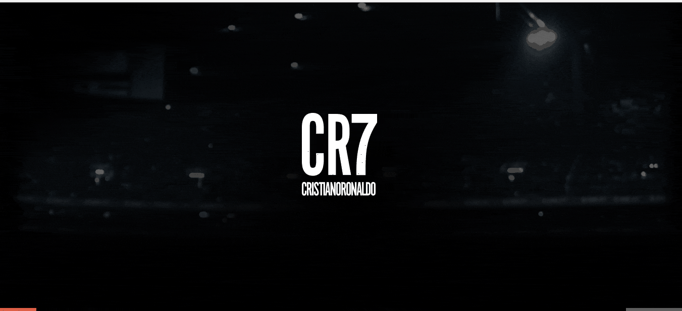
Source: cristianoronaldo.com
GIF and animations are holding strong ground. When we think of animations and GIF the first thing that will probably pop up in our mind is our childhood fanaticism of Disney. Or we may jump to the recent trend of internet memes on social media. Most of the content we are introduced to in this respect is merely entertainment, and therefore it becomes difficult to picture animations and GIF serving a more professional purpose.
Welcome to the modern world where norms have long been thrown out of the window. The current trend is to innovate by stepping out of the bonds of traditionalism. Recently, there has been a surge of websites using animations and, GIF and these are not just media related websites but even corporate and entrepreneurial websites are quite outrightly following this trend.
Animations in websites could either serve an informational purpose or have a purely decorative motive. In both cases, it is important to be careful that these are secondary adornments to the website and therefore should not overshadow the main content. In fact, the reason for using them is to guide the user to the main content. They are mainly directionals i.e. even the animated adornments are meant to do the same.
Mainly Informational animations are used in the currently trending Simplistic website designs. Due to the simplicity of these websites, sometimes these designs compromise the usability of the site. It can be a daunting task to create a perfect amalgamation of Simplistic design with maximum information and data. In such cases, animations and GIFs play their cards. These can be in the form of pop-ups or highlights that inform the user that a particular word is clickable or can even prompt them to a subscription or exploration of the site.
Now, why would a user spend time exploring a website that doesn’t interest him? So, designers bring in decoratives. These animations/ GIFs could be in the form of a large video, unlike the small animations that we read about earlier. A short video can be useful in creating an emotional connect with the user. This technique is essential to establish a brand with loyal customers. Once they are emotionally connected, they will develop interest and affection eventually amounting to the company’s benefit.
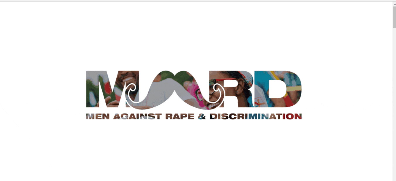
If overdone, this feature, may be too overwhelming or distracting for the user and may yield negative results. Mard, an NGO for women, uses a similar interface with flashing images inside a mustache silhouette in it’s landing page.
3. Tint Tactics
If you’d scroll through the internet a few years back, most websites you’d have a simple white theme. But now the tables have turned. Gloom is the new in, and dark colors serve the purpose.
Color Themes conceptualize websites and concentrate focus on it. Some colors elicit vigilance in the mind of the reader whereas there are some that provide a soothing and calming effect. For example, most news channels/ websites use red headers and other related themes. This color chosen is because red falls into the former category. Besides this, Duo-tone technique, color contrast, complementation, vibrancy, etc. are all elements to be taken care of while dealing with the colors scheme of a website. Gloomy wood is a gaming site that takes its users into their world right from their landing page.

Duo-toned website theme is a growing space in the world of web designing.
Colors need to fall in line with every other element of the Website. From text font to the layout of the Website, everything needs to fall into a perfect symphony. Designers may place a vibrant overlay over an image. Such overlays create a distinction between dark and light shades in the image while creating a soothing constancy of color at the same time. The latest trend in this zone is to use Duo-tone which creates a more organized effect along with establishing a psychological link in the mind of the reader. A frequent user may be reminded of the website every time he/she comes to a similar combination of colors. This tint technique can be rather effective. Just as GIF and animations these can also be an overwhelming experience and therefore needs to be used in appropriate quantity.
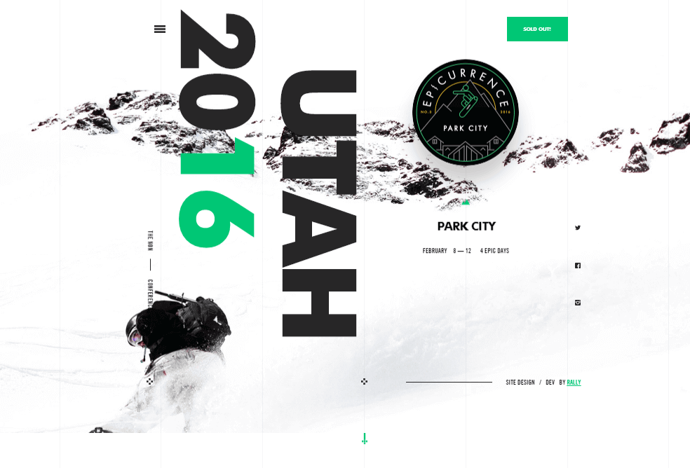
4. Apparent Chaos
Users look for reality even in their virtuality. The chaos that we see in the world had to find its way into web designing.
This design feature is probably the most trending feature in the market. Web designers are gradually moving out of original layouts and creating superficially chaotic websites.
Teaming it with open composition designers are doing wonders in this space.
Although Simplistic websites are easier to understand, chaotic Websites elicit interest. Besides this, the chaos is merely a veil of disharmony. There is an undermining harmony in the website that follows all the traditional guidelines of website designing.
Epicurrence is a website that uses this feature of apparent chaos paired with simplicity and freedom of composition.
5. Broken Symmetry and Discontinuity
The long exploited idea of Symmetry surveillance to be ruled out. This Symmetry is being challenged by new designers that are using asymmetry in their design to fight of the nonchalance of users that step out without exploration.
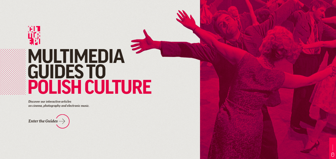
Asymmetry does not mean a lack of balance and clarity on the website. It is rather a lack of mirrored layout that creates a creative balance at its countenance. A usual way of creating asymmetry while still managing to balance the interface is by utilizing images. Images are either paired with texts or used to create entire backgrounds. The foreground in such sites displays minimal informative writing. Culture.PL effectively makes use of asymmetrical balance in its website. Their landing page is creative! Fresh! And Elegant!
6. Minimalistic Design
Simplicity is the key!
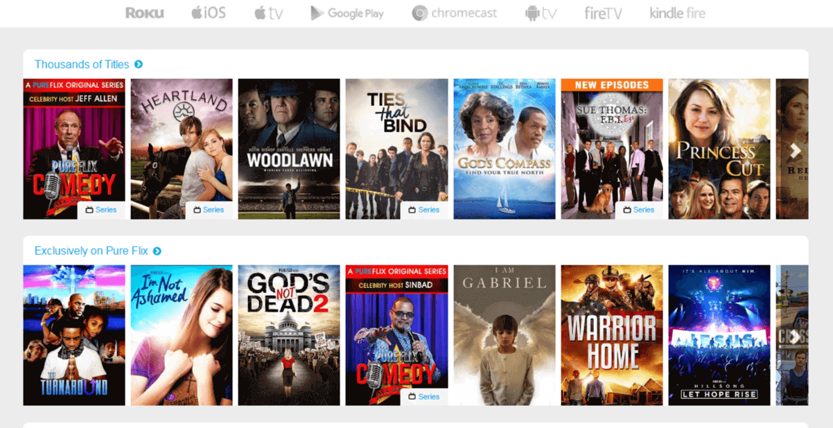
In contrast to the fourth feature in this list, minimalistic web designs are also quite a trend of the time. There is a difference between minimalistic and simplistic designs. Simplistic Designs that dominated this industry during its initial years are now being overlined by others. Minimalistic designs give out creative vibes to the user, unlike Simplistic Designs that could be too pale and mundane to work through. A recent trend in this space is the use of the card style or grid. Pure Flix‘s simple yet creative idea does not compromise with information.
Since pictures speak louder than words; we apply the formula to websites. Pairing it with images that reduce the use of other extreme features that may be too confusing for the user. Such layouts are content centered designs that mean to make the content more expressive. Designers use their creativity to accompany the content and not outshine it. Such efficient usage has brought back the idea of simplicity in a fresh and more creative packaging.
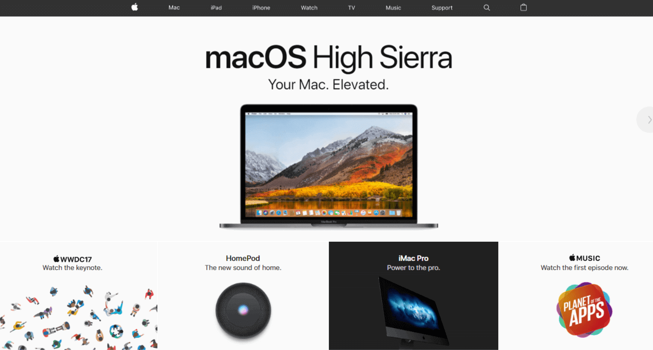
Minimalistic designs create an illusion of lack of hard endeavors.They attract the user not by design but by the content of the website. This technique is useful in creating an honest and organic user base. Apple uses minimalist design paired with an accompanying background that elucidates the theme and purpose of the website.
7. Dark Aesthetics with Serif Typefaces
With series and movies like Twilight and Vampire Diaries, Dark has turned trendy. Gothic themes have found their way into web designing.
One feature that may probably be the most noticeable feature in web design trends is the dark atmosphere in recent internet sites. Dark Aesthetics along with serif typefaces are catching momentum over the last few years. With some of the most popular websites following the same design trend. While Sans Typefaces may be comparatively new in the market, it is Serif Typefaces that adorn the latest trending websites. Probably since it complements the dark aesthetics perfectly with their end strokes, Serif Typefaces continue to rule the market. This feature accompanied with others on the list could be a real game changer turning dull and boring web designs into something time worthy and incredible.
The Next Rembrandt uses dark aesthetic along with serif typefaces to create an aura of artistry.

An important point to keep in mind is that if not used carefully, dark aesthetics may overshadow the content and turn all the design endeavors obsolete by ruining readability.
This drawback is one of the reasons why dark websites, despite being in trend are not used in abundance across all Websites. According to a recent survey, light designs are preferred by the general web-going audience by 47%
An efficient dark aesthetic web design is the perfect blend of images, text, and color. To create a dark atmosphere, does not mean a completely pale and colorless interface. In fact, light spaces are necessary for dark web designs to balance the overall depth of the website.
Some of the popular Websites that use this design feature effectively to serve the purpose that a Website design is supposed, i.e., attract the user to the content rather than to the website are
A good web designer, aware of all these trends along with the knowledge of creating an equilibrium in their usage could do wonders with the most basic website. On the other hand, someone oblivious of all the pros and cons may turn it into ruins.
We do not take designing for granted, and we hope that this blog helps you understand why you shouldn’t too!