


Current website trends in Australia indicate that web development has attained a commercial inclination towards SMEs. It seems people are getting more concerned about the things they should know to develop their websites which have directly contributed to the rise.
Let’s look at some statistics:
According to a business report by Sensis 2016, 60% of SMEs “with websites believe this has improved the effectiveness of their business”.
“For the first time, a web presence was reported by more than half of all Australian businesses” in an ABS survey from 2015-16. Neither of these statistics should come as a surprise, for internet users are estimated to make up 85.1 percent of the Australian population.
With the splurge we have been witnessing in the past decade, these figures are only believed to grow, and I don’t find a single reason as to why they shouldn’t.
 Talking about the evolving trends, 2017 has been a year full of cutting-edge, innovative ideas that have brought a lot of businesses online. The best part was their incredibly good performance on simple yet powerful websites, so turns out the year 2018 is also anticipated to have a lot of concepts that are well optimised for mobile devices and are heavily focused on revamping user experience with an interface that is simple yet unmatchable!
These sites would feature new types of formats, styles and technologies. Are you ready to embrace this breakaway to your brand’s advantage?
While the past has been a trend of web-safe colours, the future calls for a more courageous approach to picking colour contours with saturation and vibrancy combined with headers that are no longer just horizontal but reincarnated with slashes and hard angles. Let’s look at some more practices that would bear fruits for business in the year 2018:
Trends to Target This Year
1. Web Animation – The Evergreen Trend
As browser technology advances, more websites are switching from static images to finding new ways, like animations, to interact with users in their communication approach.
Here is an image from the Discovery theme of the WordPress that depicts how an animation can bring your business idea into a clearer picture of understanding.

Particle animations mentioned earlier centred mostly around backgrounds, whereas smaller animations are helpful for engaging the visitor throughout their whole experience on the page. For instance, graphics can animate the user while the page is loading, or show the user an exciting hover state through a link. They can also be made to work with scrolling, exploring or as the focal position of the complete site.
Here is an example of particle animation from the DEUTSER:

An animation is a beautiful tool for involving users in the story of a website, letting them introspect their potential future as customers in the characters. Even if you are just interested in animations for abstract visuals, they work well to create meaningful interactions with your visitors.
2. Custom Illustrations – Because Creativity Is Infectious!
Illustrator is Awesome. It’s incredible how it has come to become a versatile media that can create images that can be fun and cleverly expressive, at the same time.
The artists experienced with illustrators that are full of personality and tailored to a brand’s tone that gets bigger with each passing year.
While this trend is suitable for businesses that are fun and energetic, it can help make brands that are typically looked upon as serious, right-brained, and more open to their customers. Whatever your brand identity is, there’s likely an illustrated chance to match it with the pictures.
Modsquad is a wonderful example of a website made using custom illustration to give you an idea of the impact it can create.

3. Let The Gradients Do The Talking!
Flat design has been a dominating web design trend over dimensional colours for the past decade, but gradients are getting back on the trend list too soon. Here is a wonderful example of a translucent gradient design that would give this trend a whole new outwardly look from the Motocms:

The design is subtle, translucent yet very expressive and can be modified to convey the right message to the right audiences.
Gradients could turn out to be big, loud and full of creativity. They are also a great way to get a plain image look intriguing and fab. Even a simple gradient background can be the perfect on-trend solution if you don’t have any other way out.
4. When Big Bold Typography Kicks In
Typography has been a powerful visual tool, able to create an impression, trigger emotions and set the air of the website that conveys the relevant information. And now, because device functions are getting sharper and easier to comprehend, I expect a splurge in the use of customised fonts.
Excluding Internet Explorer, many browsers can support manual typefaces that are started by CSS for web browsers. Here is an outstanding example of big and bold typography from the Prime & Fire that is expected to make a great comeback in 2018:

Isn’t this a statement in itself? The words speak at lengths, and the elegance is just irresistible!
The fashion of big alphabets, unlike the sans serif and serif titles, would help invoke dynamic parallels, better the UX and best of all, keep the visitor hooked to your website.
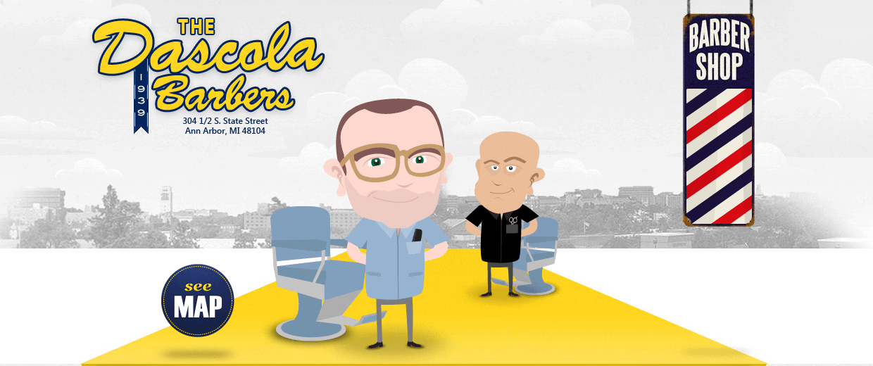
5. 3D Design – Create An Illusion Of Depth
3-D has disrupted the entertainment industry like no other, be it movies, video games, or the education sector. In all kinds of science fiction works, buzzwords like “space-time distortion” and “overlapping” have managed to thrill spectators for the longest period of time. The use of 2D design has become a thing of past in web-design industry and, from the very beginning of this year, it’s well-placed to pick up more 3D effects. Look at this amazing piece of work by dascolabarbers:
Apart from the above design elements, there some other areas where you can score above your peers by focusing on certain distinctions that might not hold importance firsthand but signify your priorities and are very deterministic in making a great impression. Let’s discuss them:
6. Content Focused And Minimalistic Design
There’s a thing about minimalistic designs that make them rewarding, they focus on one thing really well. I mean if your visitor is looking for something that’s more than just a look and feel, you can blindly stick to this approach.
A visitor that arrives at your website is looking for some return value for his time invested. So provide him with that!
Some ways can be employed by SMEs to Measure Website’s UX and hence its performance.
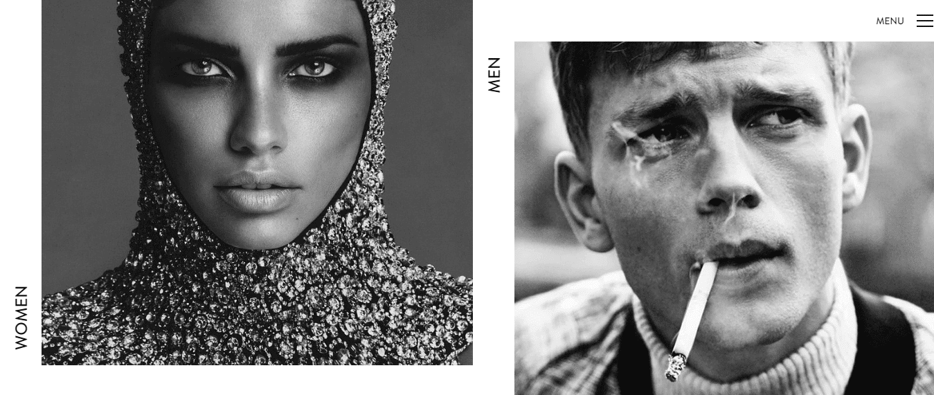
Content-focused experiences are moments in which content drives the design. Here is the snapshot of the Elite model website that has taken minimalistic navigation to its next level:
A designer’s mission is to ensure nothing inhibits a user from acquiring the information that a piece of art provides. In an endeavour to comply with this trend, designers have been concerned about following visual aspects of the design:
- A visual hierarchy – a Good hierarchy in design smoothens the task of content consumption.
- Functional minimalism – By excluding unnecessary details it’s possible to offer a neater, more focused experience.
- Whitespace – Giving content a room to breathe greatly improves a user’s experience
7. Saving The Biggest Asset
What’s the greatest asset you own? Turns out its time and we’re all trying to push limits with it.
People who have achieved their share of saved time have done it by providing much more than relevant information in an easy-to-consume format. They create an intuitive experience that reduces hassle and saves time. Importance of website speed cannot be ignored when time-saving strategy comes into play.
For some great time-saving website designs, you can go through the websites of Virgin America or Airbnb. Uber has also made it possible to save time and increase productivity manifold ever since it updated its website in December 2016:

I think this marvellous making is here to stay, and hence are a number of businesses are expected to keep up with it. Check out some amazing time-saving web design tools that will help you get a kick.
Time-saving design allows users to take only some steps from the time they visit a site to the moment they take action. It has following characteristics:
- Clear Navigation
- Context-specific information and features
- Guidance
- Linear user journey
- Anticipatory design
Though these things represent only a part of possible design features that can save user’s time, you can still find different extensions to it to cut down yours.
Understanding The Website – Best Practices
Focus On Your “People”
Just like in the real-time business environment your smile will give you a positive countenance that will make people feel comfortable being served, your website needs to create a similar breeze.
Keep your end user in mind while you begin to work on your website, it’s a portal to attract your target audience and give them the information they need to decide if they want to become a new client.
You need to ask yourself following questions:
- Do your customers know your brand or services?
- Do you cover and address all your target markets?
- What makes you different from your peers?
- What do you care about?
CTAs That Signify Value To Customers
CTAs are quick calls for actions that work wonders when used correctly; giving valuable CTAs at your landing pages like a free ebook download or a useful subscription to your newsletters are things that attract your target audience. You can also generate leads with website contact forms that might give you your entrusted group of readers.
Generally in marketing, quality matters far more than quantity—for example, it’s better to have one landmark piece of content than a hundred pieces of fluff. But in conversion marketing, both quality and quantity matter. If you don’t have call-to-actions throughout your site, users will never have the opportunity to convert.
Headlines That Roar
Your headline will be the first thing to catch the visitor’s attention, and it’s going to form the first impression. Writing a good headline is an art. Ensure you’re writing as terse as possible but make sure the idea is clear; visitors usually stop reading after only a few words, so make the most out of those words, make them read more!
You’ll want to explain what you’re offering in a way that’s more clear than intriguing—it’s just as important to keep your users informed as it is to draw them towards yourself. Use your website as a two-edged sword!
A Warming Unique Value Proposition (UVP)
UVP is something that needs figuring out before anything else. How else are you going to introduce your brand?
Ensure that the value that you’re offering to your users is something they won’t be able to get elsewhere. You can use your UVP as a tagline, or put it in your services somewhere, but make sure it is visible as the major takeaway from your brand.
A Language Simplistic And Easy To Follow
It’s okay to know more than you give out. You can still be the fancy writer you are if you write in a way that’s simple and clear because your readers need it that way.
An easy-to-follow language will help you appeal to a broader section of your audience; bigger words and more complex sentences would appeal to well-educated individuals, but then you have to exclude everybody else from the clique of your readers. Even if you’re interested only in educated individuals, there’s no point in using ornate styles to convey something plain straightforward.
Play With The Colours
Fonts function much like colours, but specifically for your text. Like with colours, subtle changes here can make a big difference, so you’ll need to experiment to find the right combination.
However, you’ll also need to bear in mind the impact your font choice can have on your brand image. Readability and visibility are your top priorities, apart from adhering to your brand standards.
So, for all you’ve managed to learn from this article, it’s important that you keep experimenting with it. Apply the change, see if it works, and follow the chain! To optimise your conversion rate even further, and keep it growing indefinitely in the future, you can never stop experimenting! Try new everything! That’s how you roll in this arena. Designing a fancy site is not enough, it is equally important to keep a check on the health of your website. One way of doing it is to generate an audit report for your website and analyse all the issues listed.
Your conversion rate won’t become perfect overnight, but if you remain committed to improving it, eventually your ROI will improve. There’s no one combination of elements that will work for every brand, but if you tinker around enough with best practices and experimentation ideas, you’ll discover what will sell!