When it comes to designing the interface of a mobile app, it is not at all a child’s play. After all, a good app interface isn’t just about how it looks and feels, but also how functional the design is.
A mere presence on an App Store or Play Store doesn’t benefit the customer or the business. Once the user downloads an app, the interface must contribute towards easing out the user’s life, while getting them attracted to the design and aesthetics.
App users tend to look for understandability, personalisation and efficiency when choosing an app and every good User Interface(UI) makes it a point to cater to that.
As such, there isn’t any hard and fast rule to design the best app interface. However, getting certain things right and avoiding major mistakes can help you achieve a lot in that regard.
What Are The Most Common Mistakes In Mobile App User Interface?
Since UI design is quite multi-faceted in approach, even the most experienced designers tend to make these common mistakes.
Here are some of the repetitive design flaws seen in the interface of many mobile apps. Also, explained are some of the best practices to avoid making those very mistakes.
Here they are…
1. Starting Out Without Understanding The End Users
In order to build an interface design that is end-user oriented, it’s vital to spend some time on understanding their needs, behaviours and preferences with proper focused initial research.
As a UI designer, you might have specific tastes and preferences. However, an interface design job well done on your part means building something that your ultimate app user will appreciate.
This means picking the right colors, fonts and designs that align well with their taste, mood while using the app and of course the purpose of the app.
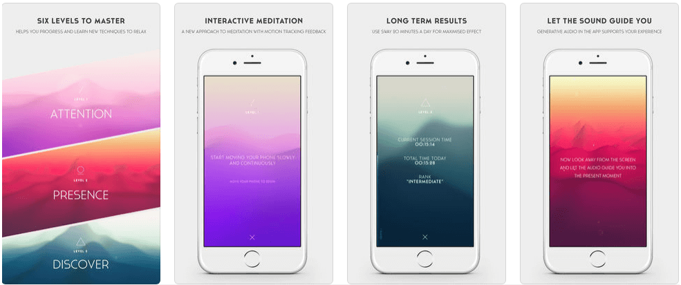
App Interface Design Of Sway by PauseAble
For instance, in the above design, the color palette and fonts opted, go well with the theme of the app – Sway. Since Sway enables people to meditate, the interface design helps by ushering in a sense of calm with the combination of its chosen design and fonts.
Interestingly, a very common mistake made by many app developers is designing the apps for people who are always on the go. As per a study by Google, as many as 60 percent of users use their smartphones at home. Another study says that around 75 percent use phones when in the bathroom.
This behavior pattern means that if your app requires attention and is worth for the user to spend time on it, he or she will do so and use it in the appropriate environment.
Leaving out important parts so that it’s quickly navigable might not make sense for all apps. Hence, while designing, it is pertinent that you never lose sight of who exactly you’re designing for.
A great way to achieve that is by starting out with closely leveraging empathy maps.
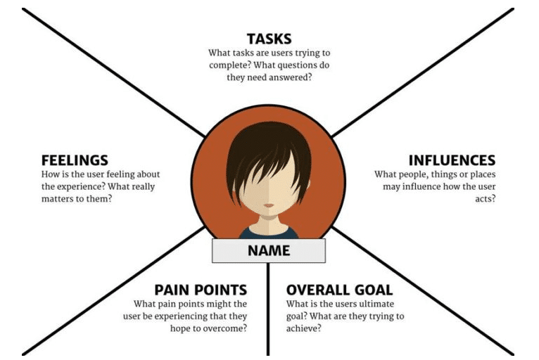
Empathy Map
2. Ignoring The Information Hierarchy
Another common practice is to start out with designing the interface of that part of the application that is easiest to design or which covers the core feature of the app.
However, this approach is flawed unless it precedes some careful thought towards laying out the right information hierarchy.
The key to getting the UI right is to understand that only those things that are important to the end user are truly important.
The layout must be planned before starting with design to ensure that the app is easily accessible and navigable for the user. The prioritization should be by popularity and this choice should be made only after research.
While designing the navigation, it’s important to keep it simple and intuitive. The categorization must be limited, relevant and well placed.
Once these things are in place, it makes sense to execute the actual design process.
3. Focusing Only On Functionality And Not Aesthetics
As much as the design does need to contribute to end-user functionality, good aesthetics can make a big difference to the end result. As a fact, the first impression can be related to design by up to 94 percent.
Human emotions really play an important role in decision-making and a design that fails to infuse positive feelings is unlikely to be successful in spite of being highly functional.
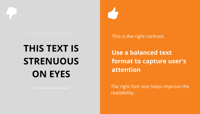
In that sense, having aesthetically appealing designs with well-chosen colors and the right contrast make an app’s interface far more attractive and preferred among its users.

Lack of contrast in design makes it unattractive
4. Designing Before Finalizing Content
Even though you might get instant client approval with an aesthetically appealing design with a dummy lorem ipsum in place of the real content, this commonly followed approach is absolutely wrong.
It’s popularly agreed upon that design without content is nothing more than mere decoration.
Ideally, content should be the first step, since the app is all about a user engaging with its content. If the app doesn’t cater to the user’s content needs, the purpose of downloading it becomes void, no matter how beautiful the interface is.
Hence, the content part must start before the designing step on the assembly line. Prototyping without the real messaging can result in an unrealistic design, which can completely fail when the actual content is added. Very often, the space left out for content falls short than what’s needed optimally.
5. Engaging In Font Abuse
A significant element in a good UI design is the font. Fonts are leveraged to display the textual content and they largely determine the impact delivered by the message.
Ideally, the font selection must be restricted to the option that is simple, familiar and readable. It must go with the emotion of the messaging.
As a practical fact, if the app design uses inconsistent fonts or sizes across screens, the impact and appeal of the user interface get significantly distorted.
A common practice observed with many interface designers is that they set the font as the system font of the operating system of the hardware device.
Doing so is safe, but it can sometimes result in a challenge. For instance, say in a Samsung device, if the user changes their default font preference to something that will simply not go with the interface design, the app can end up looking extremely unappealing.
Another pertinent point to be careful about with fonts is that every font is essentially a software that comes with a license.
Embedding one into the app without going through the terms of usage can end up attracting uncalled for legal troubles.
6. Infusing The Screen With Too Much Clutter
There was a time when smartphone screens were small and there was too much to fit in, in those small spaces. With the changing and increasing screen sizes, having a breezy design is becoming simpler and turning out to be very important.
While it’s necessary to include all the vital information in a quickly navigable manner, designing the app interface as an application of information overload can only cause analysis paralysis for the user.
If your design presents your users with too many competing options, it can overwhelm them and prevent them from finding what they’re looking for.
This naturally can get cumbersome and avoid them from wanting to tune in again.
Ideally, your design should be strategized to focus the user’s eyeballs on the most significant aspects.
Overall you should follow a minimalistic approach and be as intuitive as possible at every point of your interface.
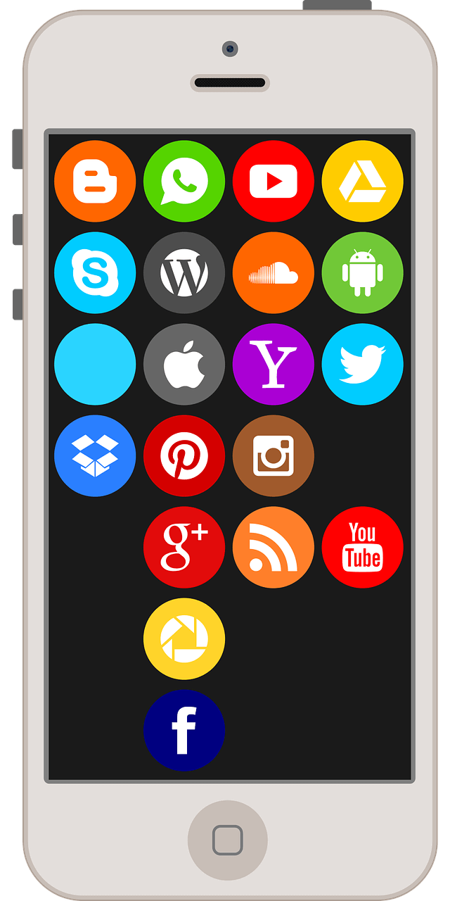
Too Much Clutter In Interface Design Disturbs The User
7. Confusing Minimalism With Simplicity
Many a time, trying to overdo the minimalistic design, unfortunately, results in friction. Less is always better than more, but too less is not a substitute for adequate.
The focus of your design should be to make the interface as intuitive as possible with immense clarity for the user on what to find and where.
The pivotal guiding principle behind your interface design should be to reduce the learning curve for your users.
If extreme minimalism defeats that, you should only apply it restrictedly.
For instance, many apps have a hamburger menu to support a very clean design. Unfortunately, if that element almost always gets missed out, the app user isn’t going to benefit and might abandon your app before spending more time in looking for the options.
Similarly, not labelling your icons if they are uncommon, can be another minimalistic approach that demands more attention to your user’s part. Alternately, removing a button that makes a user’s life much simpler is another example of minimalism gone wrong.
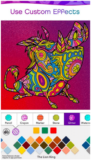
App Interface Design for Color By Disney
As a good example, Disney’s coloring app does use unconventional icons. However, they make it a point to label them so that the user can quickly grasp what they’re looking at.
8. Having Inconsistency In The Design
When it comes to decoding the navigation for mobile apps, people often learn by doing. In other words, once they figure how things work on a page of the app, they use that knowledge to work their way through the other pages.
If most of the pages in your app interface design are inconsistent, it really spoils the look, feel with your application design.
More importantly, it disturbs the intuitive element of navigation. It confuses the user with the mixed signals, demands more of their time – something that your design must never force the user for.
Ideally, you should go for the same colors and elements and repeat the patterns wherever possible. If the objective of the screen doesn’t go with the remaining patterns, you must ensure to keep in mind that when put together, all the pages look complete as a whole.
Following style guides are very helpful in achieving this.

Consistency In The Design Makes A Better User Interface
9. Following The Same Approach In Both iOS And Android
These days it is possible to clone an Android App and transfer the exact design, layout and navigation completely identically in iOS. While that might save time and cost, it might not turn out to be the best decision.
Users on both platforms have their own set of preferences, and your design should incorporate that.
They’re used to a certain way on each of the platforms and your design shouldn’t force them to learn from scratch.
Ideally, you should create an interface design that is consistent with the visual element on the relevant platform.
For instance, maintain similarity in the buttons, colors, iconography and so on.
10. Leaving Out Very Limited White Spaces
Many UI designers tend to have the tendency to fill all the empty space they have at their disposal. They feel that white space is a space wasted.
What they fail to understand is that the empty space has a significant utility of its own and is in itself an essential element in the UI design.
Well, thought out white space helps to prioritize the content and make it far more readable, by reducing the amount to be read at a single go. With its aesthetic appeal, it lends a touch of sophistication and contributes to the integrity of the design.
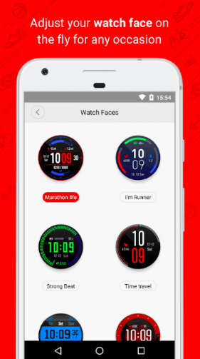
White space is significantly leveraged on e-commerce sites.
The Amazfit app interfaces too as a case example demonstrate great prowess in leveraging white space.
11. Over-doing The Innovation
While most people desire to create an app interface that is to design a breakthrough innovation and different from the rest, it’s important to not overdo this part.
Apps are built to help users solve their problems. If the innovation aspect in the interface design places a cognitive load on the user in trying to understand the changes, the unfamiliarity and innovation get counterproductive.
As a fact, for most of the design elements, solutions already exist. If the existing ones say, for instance, a play button is available and is commonly accepted, it makes little sense to replace that with an innovative symbol meaning the same.
People are generally averse to change by nature and prefer similarity as long as it is comforting. Hence, you should attempt at innovation mindfully and selectively.

App Interface Design Of Current By Finco Services
If you look at the user interface of Current, an app that helps parents teach their kids about finances, they bring in innovation with some interesting and fun colors, but don’t do away with the familiarity and clean layout of financial apps. Even for the symbols, the go ahead with the most familiar ones that almost everyone recognises.
Conclusion
Designing a good user interface is a multi-layered task, much beyond only aesthetics or functionality. It’s about getting the smallest of elements right as a collective bunch.
In order to achieve that, it’s important to start with good understanding and planning followed by meticulous execution of the designing details. Each small part has a significant impact on the end result be it as small as font size, the color palette, the design elements or even the icons.
Even though there is no rule of thumb that guarantees a great user interface, answering a question at each step helps to improve outcomes significantly. That question is, “Does this go with the need, mood and mindset of my end user?”
Looking for the proficient app makers for your business needs? Get in touch with our experts today!


