


We all know that when it comes to mobile app development, two major platforms dominate the landscape: Android by Google and iOS by Apple.
The quarter 3 (Q3) 2023 mobile app market share data reveals that Android positioned itself as a market leader on the global platform with a whooping share of 70.5%. While Apple iOS remains intact at its second position with a fairly increasing market share of 28.8 percent worldwide.
However, the market share of both giants observes a huge impact due to geographic and demographic reasons.
| The Australian smartphone sales data shows the purchases made by end-users for Android and iOS in 2022.
|
The above data demonstrate the market share differences between the two mobile app giants. Android, and iOS share many similarities and also exhibit significant differences in the app user interface (UI) design.
Understanding these distinctions is crucial for developers, designers, and organisations seeking to create mobile apps that resonate with their target audiences and help in increasing sales and revenues for their respective businesses.
[Also read: How to Enhance your Business Sales with the Mobile App Development]
This article will explore the critical differences between Android and iOS app UI design, helping you make informed decisions for your mobile app development projects.
We’ll also learn about both platforms’ design guidelines— Human Interface Design (HIG) for iOS and Material Design for Android—these design guidelines form the basic structure of the difference between the two mobile operating systems.
Let’s begin to unleash significant differences between the two operating systems of the mobile landscape.
What are the Design Guidelines for iOS and Android?
Design guidelines for iOS and Android are the set of instructions, recommendations, principles, and best practices developers should follow when creating user interfaces and experiences for mobile application platforms.
The design guidelines, also called design rules, are provided by Apple for iOS and Google for Android to ensure a consistent, user-friendly user experience.
The design outline for iOS provided by Apple is called Human Interface Design (previously called Flat Design Guidelines), whereas the Android design given by Google is called Material Design Guidelines.
- Human Interface Design Guidelines (HIG) by iOS – Apple’s design guidelines for iOS are primarily based on the flat design outlook. They use less shadowing, which gives a feeling of layered or flapping elements. These guidelines focus on creating a clean, consistent, intuitive user experience (UI/UX) for the platform.
- Material Design Guidelines by Android – Material Design is Google’s design language for Android and web applications. It is an open-source library with a cluster of themes that the developers can use for creating interaction designs with delicate motions and visuals for various digital products.
These guidelines regularly reflect the latest trends, technologies and design principles.

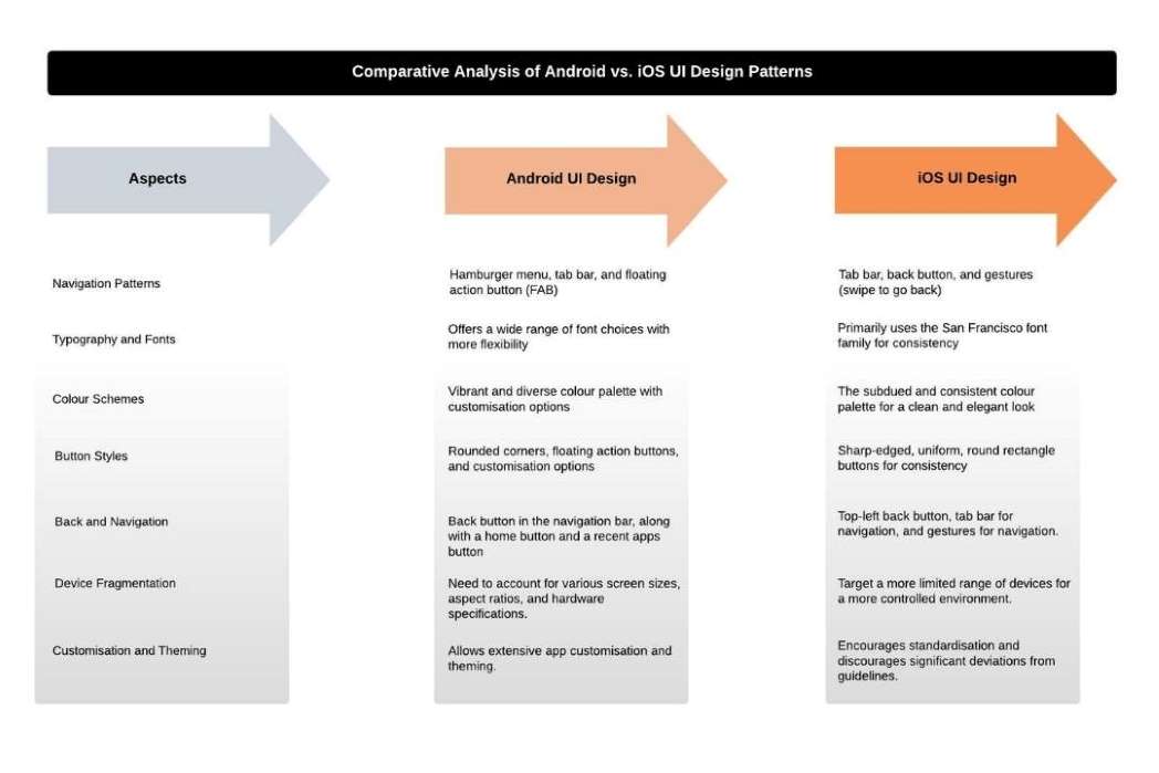
Comparative Analysis of Android vs. iOS UI Design Patterns
Let us briefly overview the critical differences in Android and iOS UI design, principles and practice.
5 Major Differences between Android and iOS UI Design
Android and iOS, they both prioritise the responsive design, consistent navigation, design patterns and serene user experience and interface. Their strong instigation towards intuitive, interactive and rational app design helps in leaving a lasting impression on users.
[Also read: Why is UI/UX Design Important for Mobile App Development]
However, Android and iOS have distinct orientations and UI designs. They run on different principles and guidelines, reflecting the unique philosophies, design languages, of Google and Apple.
Let us now understand the critical differences between these two robust operating systems and their respective UI designs below:
1. Navigation Pattern
Navigation patterns refer to how users navigate within a mobile app to access different sections, features, and content. Android and iOS have distinct navigation patterns, reflecting the platforms’ design philosophies and guidelines.
The navigation pattern differences between Android and iOS are:
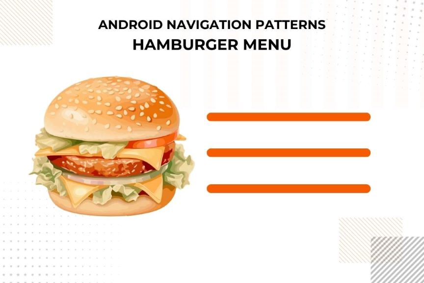
Android Navigation Patterns
- Hamburger Menu – Android often employs a “hamburger” menu, represented by three horizontal lines (resembling a hamburger) and typically located in the top-left or top-right corner of the screen. Tapping this icon reveals a navigation drawer, allowing users to access various sections or features of the app.
- Tab Bar – Android frequently utilises a tab bar at the bottom of the screen, giving users direct access to primary sections or views within the app. These tabs are typically labelled with icons and text; users can easily switch between them with a tap.
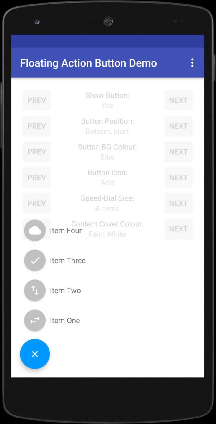
- Floating Action Button (FAB) – Material Design, Google’s design language for Android, promotes using a floating action button (FAB) for primary actions within the app. This button is typically circular and floats above the content, serving as a call-to-action element.
iOS Navigation Patterns
- Tab Bar – iOS often relies on a tab bar at the bottom of the screen. This tab bar gives users quick access to primary sections or views of the app, usually through a series of labelled icons. Users can tap the icons to navigate between different sections.
- Back Button – iOS utilises a top-left back button as a standard navigation element. Users can tap this button to navigate back within the app, providing a consistent way to retrace their steps.
- Gestures – iOS encourages the use of gestures for navigation. Common gestures include swiping to go back or forward, pinching to zoom, and tapping to interact with content. These gestures aim to provide a more intuitive and natural navigation experience.
2. Typography and Fonts
Typography and fonts play a significant role in shaping a mobile app’s overall look and feel. Android and iOS have differences in how they approach typography and fonts in their design guidelines:
Android Typography and Fonts
- xFont Choices – Android provides a wide range of font choices, allowing app developers to select fonts that suit their brand or the app’s unique identity. There’s a high degree of flexibility in font selection.
- Roboto and Noto – Material Design, Google’s design language for Android, promotes using the Roboto font family for consistent and clear text presentation. The Noto font family is recommended for non-Latin scripts to ensure proper localisation.
- Typography Hierarchy – Material Design places a strong emphasis on typography hierarchy. It encourages developers to use font weights, sizes, and styles effectively to create explicit and engaging text content.
iOS Typography and Fonts
- San Francisco Font Family – iOS primarily uses the San Francisco font family, which includes San Francisco for text and San Francisco Compact for compact text. Apple designed this family to provide a clear, legible, consistent look and feel across all iOS devices.
- Limited Font Choices – Apple’s Human Interface Guidelines recommend using the San Francisco font family for most text. While you can use other fonts, there is less freedom for font selection than Android.
- Typography Consistency – Apple strongly emphasises maintaining consistency in typography across iOS apps. This uniformity ensures a seamless user experience and helps with accessibility.
3. Icons and Visual Elements
Icons and visual elements in the user interface (UI) design differ between Android and iOS due to their distinct design languages and guidelines. Some critical differences in the use of icons and visual elements are:
Android Icons and Visual Elements
- Diverse Styles – Android icons are often more varied in style and appearance. Google encourages developers to create icons representing their brand or the app’s unique identity. As a result, you can find a wide variety of icon designs in Android apps.
- Material Design Icons – Android apps often adhere to Material Design principles, which emphasise tactile surfaces, layers, shadows, and depth to create visually engaging user interfaces. Material icons are used for consistency and can come in different shapes and sizes.
- Customisation – Android allows for more extensive customisation of icons and visual elements, enabling developers to create unique designs that align with their app’s personality and user experience.
iOS Icons and Visual Elements
- Consistency – iOS icons follow a more consistent and strict design guideline, resulting in a cohesive visual appearance across all apps. Apple encourages developers to use standardised icon styles and sizes to maintain uniformity.
- Flat and Minimalistic – Apple’s Human Interface Guidelines (HIG) recommend using flat, minimalistic icons that are clear, simple, and easy to understand. The emphasis is on creating universally recognizable icons.
- Standardisation – Apple strongly emphasises standardisation to ensure a seamless and consistent user experience. Users can expect a familiar visual style and meaning associated with icons across different iOS apps.
4. Colour Schemes
The colour schemes in Android and iOS differ in colour palettes and approaches to using colours. These differences reflect the distinct design philosophies of each platform. Here’s how Android and iOS handle colour schemes:
Android Colour Schemes
- Vibrant and Diverse Palette – Android allows for a more diverse and rich colour palette. Material Design, Google’s design language for Android, encourages using contrasting and bold colours to create visually engaging interfaces.
- Customisation – Android provides developers with more flexibility in selecting and customising colours, which allows for a broader range of styles and looks across different apps. This customisation can be used to reinforce an app’s unique identity.
- Dynamic Theming – Android supports dynamic theming, allowing users to choose between light and dark themes. This can affect the colour schemes within the app, offering a personalised user experience.
iOS Colour Schemes
- Subdued and Minimalistic Palette – iOS emphasises a more limited, subdued colour palette. Apple’s design guidelines encourage using subtle and restrained colours to maintain a clean, elegant, and user-friendly look.
- Use of Whites – iOS frequently employs white space and light backgrounds to create a bright, airy aesthetic, contributing to the clean and minimalist design.
- Accessibility – Apple is dedicated to accessibility, ensuring that colours chosen for an app meet accessibility standards for users with visual impairments. High contrast and legibility are priorities in iOS design.
5. Button Styles
Button styles in the user interface (UI) design of Android and iOS differ in their visual appearance and how they are typically used. Let’s find out how Android and iOS handle button styles:
Android Button Styles:
- Rounded Corners – Android app buttons often have rounded corners, giving them a softer and more tactile appearance. Material Design, Google’s design language for Android, promotes rounded button edges for a friendly and approachable feel.
- Floating Action Button (FAB) – Material Design introduces the Floating Action Button (FAB) concept for primary actions within the app. FABs are typically circular buttons that “float” above the content, serving as a prominent call-to-action element.
- Button Variations – Android apps often feature various button styles, such as raised, outlined, and text buttons. This variety can distinguish between different types of actions or interactions.
iOS Button Styles
- Sharp Edges – iOS buttons typically feature sharp edges and a consistent rounded rectangle shape. This gives buttons a clean and modern appearance, in line with Apple’s design philosophy.
- Solid Background – Apple’s Human Interface Guidelines (HIG) recommend using buttons with a solid background colour and simple text. This minimalist approach ensures that controls are easy to identify and interact with.
- Size and Spacing – iOS provides specific guidelines for button size and spacing, ensuring that buttons are proportionate and well-aligned with other interface elements.
Other Differences between Android and iOS UI Designs
The differences shared above between Android and iOS UI design are not arbitrary but are rooted in each platform’s distinct design philosophies and user expectations.
Let us explore some other differences between these two platforms for having a clear idea about their UI/UX deliverables and their specific usage and functioning.
Let’s get a thorough know-how of these differences below:
1. Back and Navigation
- Android typically includes a back button in the navigation bar at the bottom of the screen, a home button, and a recent apps button.
- iOS uses a top-left back button to navigate within the app.
2. Gestures
- Android employs a more extensive range of gestures, allowing for various interactions like swiping, tapping, and long-press actions.
- iOS has a limited set of core gestures like swipes, pinches, and taps for simplicity and consistency.
3. Device Fragmentation
- Due to the platform’s fragmentation, Android apps must account for various screen sizes, aspect ratios, and hardware specifications.
- iOS apps target a more limited range of devices, offering a more predictable and controlled environment.
Conclusion
Recognizing and embracing the differences is essential for designers and developers to create visually appealing and functionally intuitive apps for their respective Android and iOS user bases. By doing so, they can provide a superior user experience that aligns with the expectations and behaviours of each platform’s audience.
The selection of platforms depends upon various factrors and sometimes you may feel bewildered while picking up the best one for launching your app. Thus, it is crucial to take professional and expert assistance from an expert mobile app development company to create an innovative mobile app for your business that can guide you to make informative decisions.