


An average user spends 10 to 12 seconds on a website, and in that span, they decide whether to stay or leave.
Have you ever imagined what stuck a user’s attention on a website? An inspirational website design! You may load your website with information, but there’s a high possibility that a dull and stodgy web design will fail to capture the user’s attention.
Website designing is an art that involves enormous creativity and foresightedness, along with a thorough knowledge of the development processes. It is a process of creating and arranging the elements of a website to ensure it is visually appealing, user-friendly, easily navigable, and effective in conveying its message and purpose. A pleasing web design caters to user psychology to captivate their attention.
We are in the Q4 of 2023, and by now, we can observe the modern website design trends that exclusively rely on providing a serene user experience to the audience. It is based on web intuitiveness, artistic and technical layout, and intelligent use of graphics, texts and interactive features.

A good website is not only aesthetically designed, it should convey its clear goals and purposes.
Here, we will explore some of the hottest website design trends sweeping the digital landscape and creating a considerable impact in the online world. We’ll also analyse the 11 best website design examples to fuel your creativity.
So, let’s begin with this article below:
11 Best Website Design Examples
Website design inspiration can come from a variety of sources. Whether you are revamping your existing site or planning to build an entirely new design venture, this information teeming with the 11 best web designs will provide you with innovative ideas to initiate your web design project:
In this article, I am going to cover 11 key features of a visually appealing web design, along with showcasing 11 examples of websites that have successfully implemented these aspects.
1. Minimalism with Max Impact
Minimalism continues to dominate web design, emphasising clean lines, ample white space, and a focus on essential content. A minimalistic approach ensures a clutter-free, user-friendly experience.
Minimalism is a popular design approach characterised by simplicity and a focus on essential elements.
Apple Minimalistic Web Design
Apple is well-known for its minimalist design approach, and this philosophy also extends to its website design. It features a clean, white background, straightforward typography, and high-quality images of their products.
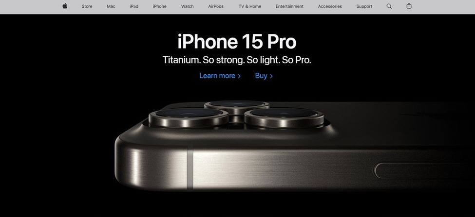
[Source: Apple]
Here, we see Apple’s website features a clean and uncluttered layout. The use of ample white space creates a sense of spaciousness and elegance. This minimalism is maintained across all pages, allowing the content to take centre stage.
Apple also employs a limited colour palette, primarily white, black, and shades of grey. This restrained use of colour helps maintain a clean and cohesive look. Apple’s minimalist design approach reflects the brand’s aesthetic preferences and aligns with its product philosophy, emphasising simplicity, elegance, and functionality.
Pro Tips
Start with a clean and straightforward layout. Avoid unnecessary elements and distractions—place content strategically for easy navigation.
Also, choose a limited colour scheme, typically consisting of one or two primary colours and a neutral colour like white or grey. This creates a sense of harmony and elegance. Use colour strategically to highlight critical elements or calls to action.
2. Dark Mode Dominance
Dark mode is no longer just a trend; it’s a smart website development technique. It reduces eye strain and adds a touch of sophistication. Designing a website with a dark mode dominant approach involves using dark backgrounds, often with light text and elements.
You can choose dark colours for the background, such as deep blacks, dark greys, or dark blues. These provide the foundation for your dark mode design. Then, contrast the dark background with light-coloured text and UI elements.
You must also incorporate bright or accent colours for interactive elements like buttons, links, or call-to-action elements. These elements will break the monotony, and stand out against the dark background.
Spotify Dark Mode Dominance
Spotify’s dark mode provides a sleek and visually appealing user interface for music streaming. Dark backgrounds and contrasting text make it easier to navigate and enjoy music, especially in low-light environments.
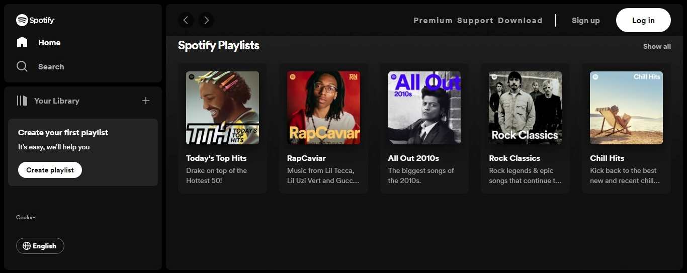
[Source: Spotify]
Spotify’s dark mode reduces eye strain and enhances the focus on the content, making it ideal for extended music-listening sessions, especially in low-light environments.
The Spotify web design uses light-coloured text, such as white or light grey, to ensure readability for the main content and interface elements. This contrast makes text and buttons stand out against the dark background, making navigating and interacting with the platform easy.
Pro Tips
Ensure that text, icons, and interactive elements contrast highly against the dark background. This is crucial for readability and accessibility. Use light-coloured text, and consider bold fonts for emphasis.
A dark mode design often employs a limited colour palette with a primary dark background. Use additional colours sparingly for accentuating specific elements or highlighting interactivity.
3. Create Positive Vibes
Curating the website with good vibes is a new trend observed in 2023. Designing a website with a “positive vibes” approach involves a web experience that radiates optimism, happiness, and a sense of well-being. It’s about making visitors feel good and leaving them with a positive impression.
Mubasic Positive Vibes on Website
Mubasic is the “Awards Website of the Day” winner of August 2022 and a hotspot music catalogue for little music lovers. It offers a unified platform for children and kids’ music and provides a quirky layout for easy scrolls.
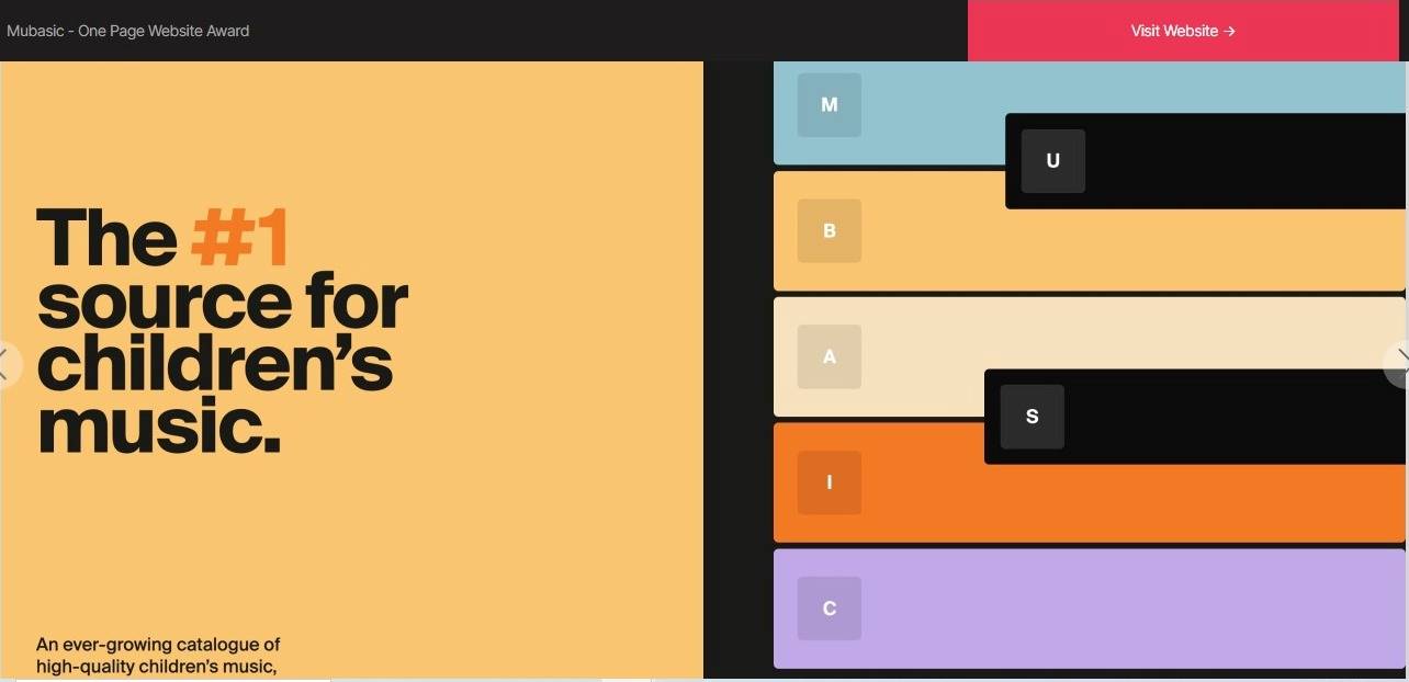
[Source: Mubasic]
Mubasic’s website is designed with a bright and inviting colour palette that includes cheerful shades of yellow, orange, purple, blue, pink and pastels. These colours make the look of the website more appealing and positive. The website also has a simple layout with bigger and easily readable fonts that resonate with the site’s purpose.
Mubasic’s optimistic use of imagery and graphics reflects positivity, happiness and well-being, which conveys a friendly and inviting atmosphere. They use a clean and uncluttered design with whimsical elements to create engagement for the user.
Pro Tips
Identify your target audiences and their preferences. Consider what resonates positivity with them, such as colours, imagery and messages.
You can include pictures of smiling people, beautiful nature scenes, positive interactions, optimistic visuals, a colourful pallet, and a clean layout to encourage positivity and friendliness on your website.
4. Futuristic 3D Graphics
3D graphics are becoming more accessible in 2023 and are making websites pop. Designing a website with these dynamic 3D graphic elements can provide a sense of depth and interactivity and add a visually appealing dimension to your website.
To use the 3D concept, decide on the type of 3D elements you want in your site. This could include 3D models, animations, interactive 3D environments, or a combination. Consider whether you want a subtle touch of 3D or a more immersive experience.
NASA Exoplanet Exploration 3D Graphics
NASA’s Exoplanet Exploration website is an excellent example of a web design marvel that uses 3D graphics to create interactive visuals of distant exoplanets. It offers an educational and immersive experience for visitors interested in space exploration.
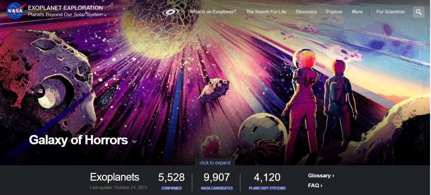
[Source: NASA]
NASA’s website features interactive 3D models of exoplanets and planetary systems. Users can manipulate and rotate these models to explore the planets from different angles. Visitors can actively engage with the 3D graphics and analyse the content at their own pace. The interactive nature of the 3D graphics enhances the user experience.
The website’s 3D graphics visually represent complex scientific data about exoplanets, such as their orbits, sizes, and compositions. This helps users understand the characteristics of these distant worlds.
Pro Tips
Design the pages that complement your 3D elements. The layout should be responsive and user-friendly, allowing your 3D graphics to enhance the user experience rather than overwhelm it. Plan how users will navigate and interact with the 3D elements. Implement intuitive controls and simple interfaces to make the experience enjoyable.
5. Neumorphism – A Soft Touch
Modern websites often feature new user experiences, and Neumorphism is an extraordinary move in the 2023 web design process.
Neumorphism, often referred to as “soft UI,” is a design trend that combines elements of skeuomorphism and flat design to create a modern, soft, and three-dimensional appearance. Neumorphic design typically features elements slightly extruded from the background with soft, subtle shadows.
Taskade Using Neumorphism Technique
Taskade, a collaboration and productivity platform, is an excellent example of incorporating Neomorphism technology in its website design. The designers have smoothly created a magical environment by including soft buttons, 3D appearances and raised, tactile input fields as if they can be pressed.
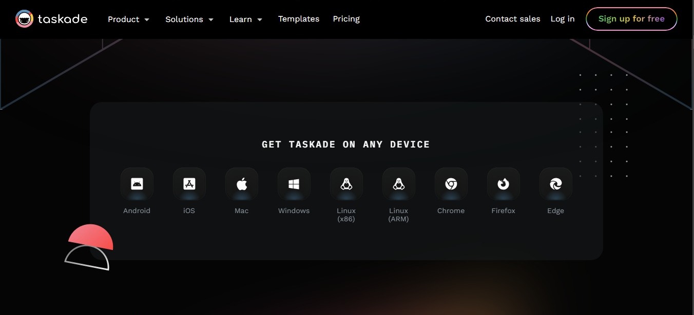
[Source: Taskade]
Taskade maintained a clean and minimalistic layout, which is a characteristic of Neumorphism. This design approach avoids clutter and focuses on simplicity, allowing the Neumorphic elements to stand out.
Taskade’s design included subtle changes in element appearance to provide feedback when users interacted with buttons or checkboxes.
Pro Tips
Soft shadows are a crucial element of Neumorphism. Use shadows with low opacity and diffused edges to create the illusion of components extruding from the background. Avoid harsh or dark shadows.
Neumorphism works best with clean and minimalist layouts. Avoid clutter and excessive detail. Focus on essential elements to keep the design simple and elegant.
6. Bold Typography
Typography can be a game-changer in web design. Bold, expressive fonts help convey a brand’s personality. Bold typography can capture attention and communicate your website’s message effectively. When used thoughtfully and strategically, it can enhance the user experience and leave a lasting impression on visitors.
Bold typography can create wonders using eye-catching fonts against a clean, uncluttered background. This makes the text stand out and draws attention to important content.
Dropbox Bold Typography
Using bold typography in Dropbox’s website design aims to make the user experience more intuitive and informative. It helps visitors quickly understand the service’s benefits and encourages them to take action.
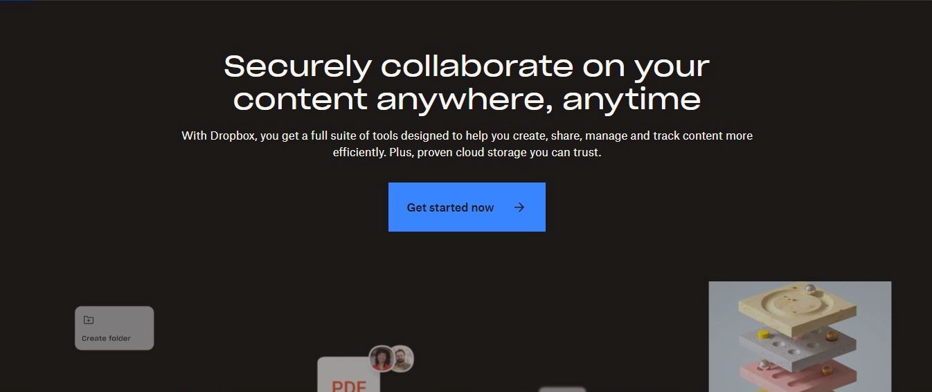
[Source: Dropbox]
Dropbox’s homepage typically featured bold, large headlines succinctly conveying the core message or value proposition. The pricing page highlights various subscription plans, including their features and pricing. This makes it simple for users to compare plans and choose the one that suits their needs.
Dropbox utilises bold typography to emphasise quotes and key takeaways from satisfied customers in testimonials and case studies. This adds credibility and trust to the service and showcases real-world success stories.
Pro Tips
Maintain a clear hierarchy in your typography. Use bold fonts for headers, titles, and essential text, and complement them with legible, easy-to-read fonts for body text. Ensure that your text is easily readable in various screen sizes.
Create contrast by using bold typography against a clean, uncluttered background. This makes the text stand out and draws attention to important content.
7. Unique Cursor
Do you know that cursors can also engage visitors on your website? Yes, the unique cursors can create a playful atmosphere on your site and draw the user’s attention to a great extent.
Customised cursors can help your site stand out and create a more memorable and immersive experience while adding an engaging and interactive dimension to the UI/UX.
CraieCraie Unique Cursor Effect
CraieCraie is a creative studio of interior architecture and global designs and an Awwwards winner website for providing rational and emotional experiences to the users. CraieCraie’s website has a lasting impact on users’ minds because of its aesthetics and the perfect use of the custom cursor method.
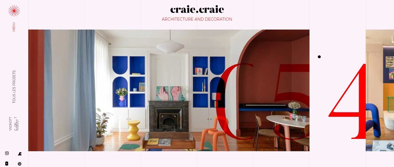
[Source: CraieCraie]
On its website, CraieCraie uses the black dotted cursor that perfectly blends into its clean and uncluttered white background. The black dot customised cursor meaningfully signifies the company logo and offers a sense of attachment and emotional connection to its users.
The most exciting part of CraiCraie’s website cursor is its text cursor effect that provides navigation ease to the audience.
As you move the cursor to any images, you can notice the black dot converting into a transparent and elegant white circle with the text inserted to provide precise information to the users while inviting them to learn more.
Pro Tips
Ensure that your custom cursor remains usable and doesn’t hinder navigation or interactions on your site. It should be easy to identify and understand. Decide on the type of cursor you want to create. Standard options include custom icons, animations, and interactive elements that respond to user actions.
Maintain consistency in your cursor design. That means the cursor should be coherent with the overall design of your website, including colour schemes, typography, and visual style.
8. Dynamic Parallax Scrolling
Parallax scrolling is one of the top design methods modern web designers use. Parallax scrolling is a web design technique that the designers apply to increase engagement on the website. It creates a visually dynamic user experience by moving background and foreground elements at different speeds as the user scrolls.
The Goonies Parallax Scrolling
The Goonies is a popular movie from the 80’s era, left a chilling experience in people’s minds. The same eerie yet mesmerising effect is created by The Goonie’s official website, which uses a parallax scrolling effect to capture the focus of its audiences.
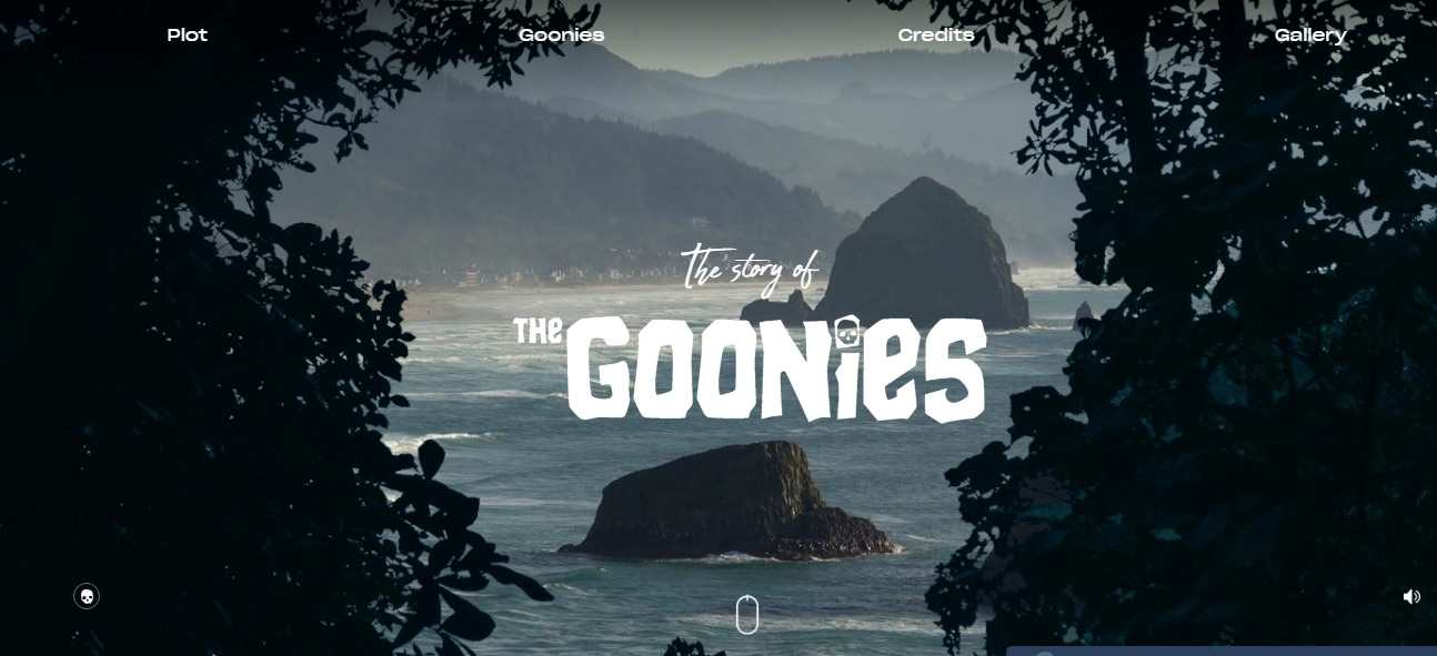
[Source: The Goonies]
The Groonies uses the parallax scrolling effect in the best possible way to create a gloomy yet curious environment that perfectly resonates with its theme. The page opens up with the movie’s famous rocky Oregon coastline, where the designers seamlessly draw the audience’s attention by using high-quality images and spooky bold fonts.
As you move your cursor, the screen will zoom in to take you to the journey of the other side of the site. The designers have applied parallax scrolling to use different speeds to the background and foreground with the help of 3D effects that level up the website’s value.
Pro Tips
There are various parallax types, including simple parallax, multi-layer parallax, and horizontal parallax. Choose the style that suits your content and design goals. You must also choose background images or illustrations for each parallax section while ensuring they are high-quality and relevant to the content.
9. Loading Screen Anime
By now, we all know that viewers hate to wait for a website to load. Hence, designing a website with loading screen animation effects can add an element of interactivity and engagement while users wait for the content to load.
A loading screen animation, also known as a loading animation or preloader, is a visual element that appears on a website or application while content is being fetched or loaded. Its purpose is to provide feedback to users that the website or app is in the process of loading and to keep them engaged during what might otherwise be perceived as a delay.
Calm’s Loading Screen Animation
Calm is a meditation app that uses the loading screen animation for the user to stay engaged while waiting for the page upload. The loading screen animation suitably aligns with the company’s core business and provides a serene space for users to relax while waiting.
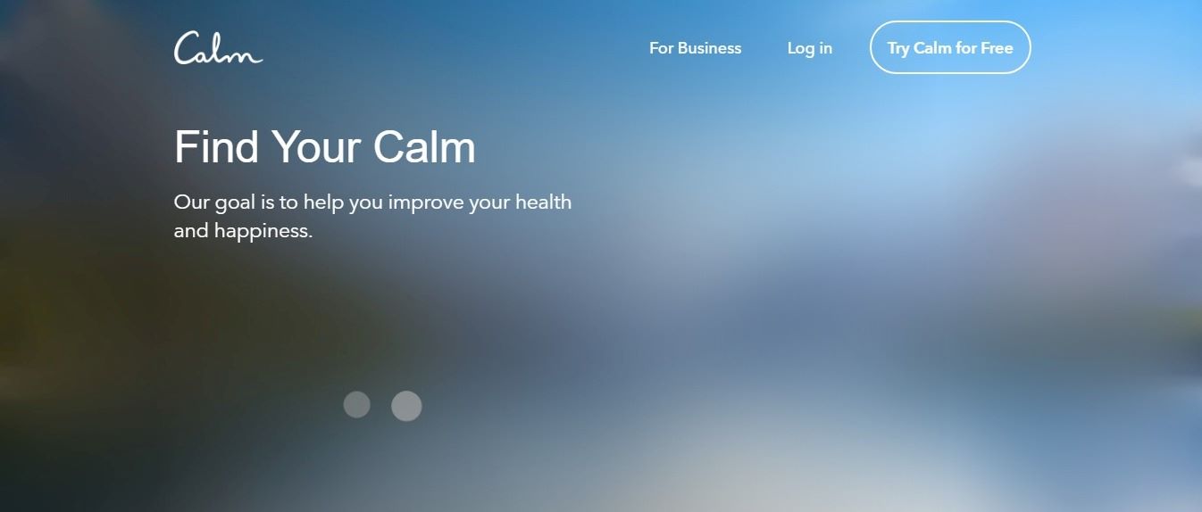
[Source: Calm]
The loading screen anime used for Calm’s website offers tranquil visual effects to the users that make them engaged while lowering the scope of bouncing the site. The designers have thoroughly used the skeleton screen instead of the classic wheel with a natural background while loading the website.
Pro Tips
Keep the animation duration reasonable. Users appreciate a loading animation that is neither too short (giving the impression of abrupt loading) nor too long (leading to frustration).
You must also use the loading screen to reinforce your brand identity. Incorporate your logo, brand colours, or slogans to create brand awareness.
10. Playful Colour Scheme
Web design with a playful colour scheme is a creative and engaging approach often used by modern web designers that applies bright, vibrant, and contrasting colours to convey a sense of fun, energy, and creativity. Brands, websites, or applications often employ this design style, targeting a youthful or lighthearted audience.
Playful colour schemes aim to evoke positive emotions, capture attention, and create a memorable and enjoyable user experience.
SeeMakePlay Colour Scheme
SeeMakePlay is an Australian company with expertise in providing interactive learning to children by teaching them art and craft at schools or parties. The website of SeeMakePlay uses a vibrant and playful colour scheme throughout the website that perfectly aligns with its core theme.
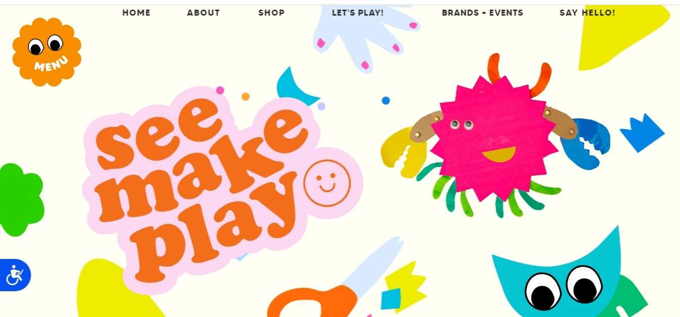
[Source: SeeMakePlay]
The company makes a smart selection of colourful animated characters and eccentric brand logo that keeps up the fun and excitement levels of its target audience. The designer’s colour pallet adds a sense of creativity, energy and cheerfulness to the entire website.
Pro Tips
Select a colour palette that includes bright, cheerful, and contrasting colours. Pastels, bold primaries, and vibrant hues work well for playful designs.
Consider web psychology while applying the effects of colours. For example, yellow can evoke happiness, while blue can provide a sense of Calm. Choose colours that align with your website’s playful theme.
11. Embedding Video Background
Inserting videos into the website is a new trend of 2023 and a robust design element that highly evokes audiences’ interests. Video backgrounds allow you to set the tone and convey a narrative or mood that aligns with your brand or message. They can create a compelling visual story.
Video backgrounds can capture users’ attention with moving images, making the website visually appealing and interactive.
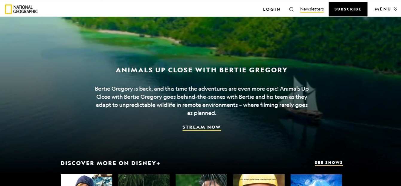
National Geographic Video Background
National Geographic’s use of video background effects aligns with its brand’s core values and commitment to education, exploration, and storytelling. It provides users an immersive and educational online experience that inspires a deeper understanding of the world and its wonders.
[Source: National Geographic]
National Geographic’s video backgrounds feature captivating, high-quality footage of nature, wildlife, and exploration.
The movement in the video backgrounds, whether the slow drift of clouds, the majestic flight of birds, or underwater scenes, captivates users’ attention. The dynamic content keeps users engaged and encourages exploration of the website.
Pro Tips
Choose a video that aligns with your website’s purpose and message. Consider using high-quality, well-edited footage that complements your content.
To ensure fast loading times, optimise your video background. Use the appropriate video format (e.g., MP4, WebM) and compression techniques to reduce file size while maintaining quality. Additionally, enable video preloading for a smoother experience.
Conclusion
Exploring and drawing inspiration from the best website designs can be a valuable starting point for creating a visually captivating, user-friendly, and effective website.
By learning from the innovative and successful designs of others, you can enhance the overall user experience and make your website a standout online destination. Therefore, skim through this article and select the best design technique to inspire your site creation.
However, if you are still perplexed, hire an expert web design agency that can take up your project with immense care and provide you with the most favourable outcome in the form of the new website design or redesigning facility with latest methodologies to captivate your user’s attention.
[Also read: A comprehensive Guide to Your Website Redesign Plan]