It is hard to imagine a life without mobile apps today. A study reveals that users spend almost 5 hours per day (or 4 trillion hours annually) on mobile app usage. The same research shows that the total number of apps installed in a year reached as high as 255 billion in the year 2023.
That’s a big number!
Looking at these figures, it is needless to say that end-users have started relying more on apps than brand websites in the past few years.
That’s where your business can take a sharp leap by adopting the best practices in app designing. However, this is possible only when you closely monitor every tiny design detail during the mobile application development process.
Designing a mobile app in 2024 requires a deep understanding of the evolving trends, user expectations, and technological advancements in the mobile industry.
52% of users don’t want to deal with a poor UX design, so there’s no reason to overlook the importance of UI/UX design components in your app.
Therefore, with millions of apps competing for users’ attention, it’s crucial to adopt best practices that create visually appealing interfaces and prioritise usability, performance, and security.
How to Design a Mobile Application?
Developing a mobile app involves a journey from concept to creation. First, you’ll identify a user’s needs and your target audience. Then, you’ll research competitors and brainstorm solutions, prioritising the most essential features.
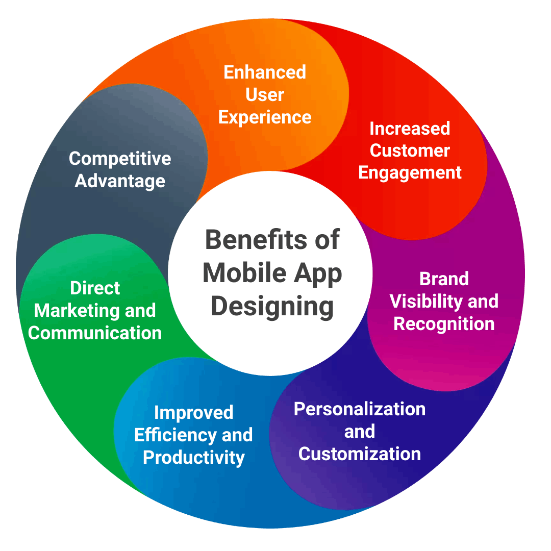
Next, you’ll craft the app’s designing that includes layout and visual style, ensuring a user-friendly experience. With the design in place, you’ll choose a development approach and bring the app to life.
Finally, testing includes product and user testing to evaluate the app’s functionality. Once done, launch, and continuous improvement through user feedback, keep your app successful in the ever-evolving mobile world.
8 Best Practices in Designing a Mobile App
Building a mobile application is a crucial process for ensuring a successful and profitable venture. And designing your app interface is a vital practice for impactful, and functional mobile applications that delight users, drive engagement, and achieve business objectives.
Below are the eight best practices in mobile app design, each with its respective do’s and don’ts and real-life examples for best understanding. So whether you want to design your eCommerce app store or a real estate application, each practice will give you an edge over your competitors.
Therefore, staying informed about emerging trends and following these best practices, you can design a mobile app that stands out.
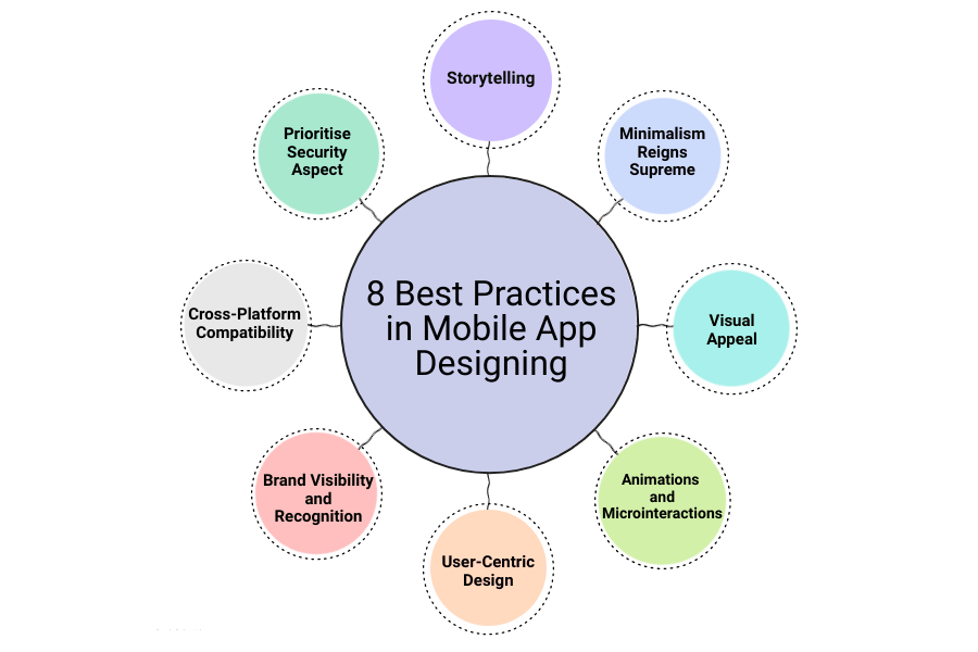 1. Storytelling: Captivate from the Start
While storytelling isn’t the single best practice in app design, it’s a powerful tool that can create a more engaging app and elevate the user experience.
By weaving a narrative or story into the app’s design, developers can create a compelling and memorable journey for users, guiding them through the app’s features, functionalities, and value proposition.
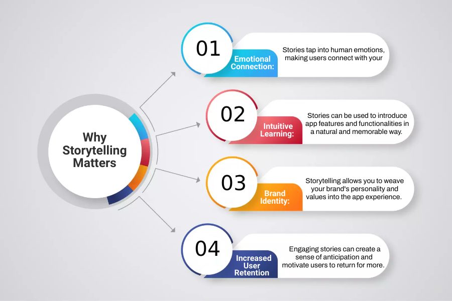
Storytelling humanises the app, making it more relatable and resonant with users’ emotions, motivations, and needs. It helps users understand the app’s purpose, benefits, and how it can add value to their lives.
| Do’s and Don’ts of Storytelling Approach | |
| Do’s | Don’ts |
| Use Visual Storytelling Elements | Overload with Information |
| Create User Personas | Use Irrelevant Stories |
| Engage Users Emotionally | Forget User Empathy |
Example: Duolingo
Duolingo uses a gamified learning approach built around a charming owl mascot, Duo. The app presents language learning as a journey, with users unlocking new levels and earning rewards as they progress.
This narrative structure keeps users motivated and engaged, making language learning feel like an adventure.
2. Minimalism Reigns Supreme: Less is More
Minimalism isn’t necessarily the best practice for every app design, but it’s a powerful approach to prioritising user-friendliness and clean aesthetics. This approach also emphasises simplicity, clarity, and functionality to create clean and intuitive user interfaces.
The minimalist design reduces visual clutter, unnecessary elements, and distractions. It focuses on essential features, content, and actions, making it easier for users to interact with, understand, and navigate the app.
It also aligns with modern design trends and user preferences for clean, minimalist aesthetics, prioritising content and functionality over excessive design elements.
| Do’s and Don’ts of Minimalistic Design Approach | |
| Do’s | Don’ts |
| Use White Space Strategically | Clutter Interfaces |
| Maintain Consistent Design | Overcomplicate Design |
| Emphasise Clarity and Simplicity | Neglect Visual Appeal |
Example: Simplenote
Simplenote embodies minimalist design principles with its clean interface, uncluttered layout, and focus on essential note-taking features. The app uses a simple colour scheme, clear typography, and minimalistic icons to enhance usability and readability.
Simplenote’s minimalist approach allows users to focus on capturing and organising their notes without distractions, making it a popular choice among users who value efficiency and simplicity in note-taking apps.
3. Visual Appeal: UI/UX Design Priority
Visual appeal is a crucial best practice in app designing as it plays a significant role in attracting users, creating a positive first impression, and enhancing user engagement.
Understanding user needs, behaviours, and pain points creates functional apps that solve problems and address user goals. This focus on user satisfaction leads to higher engagement and user retention.
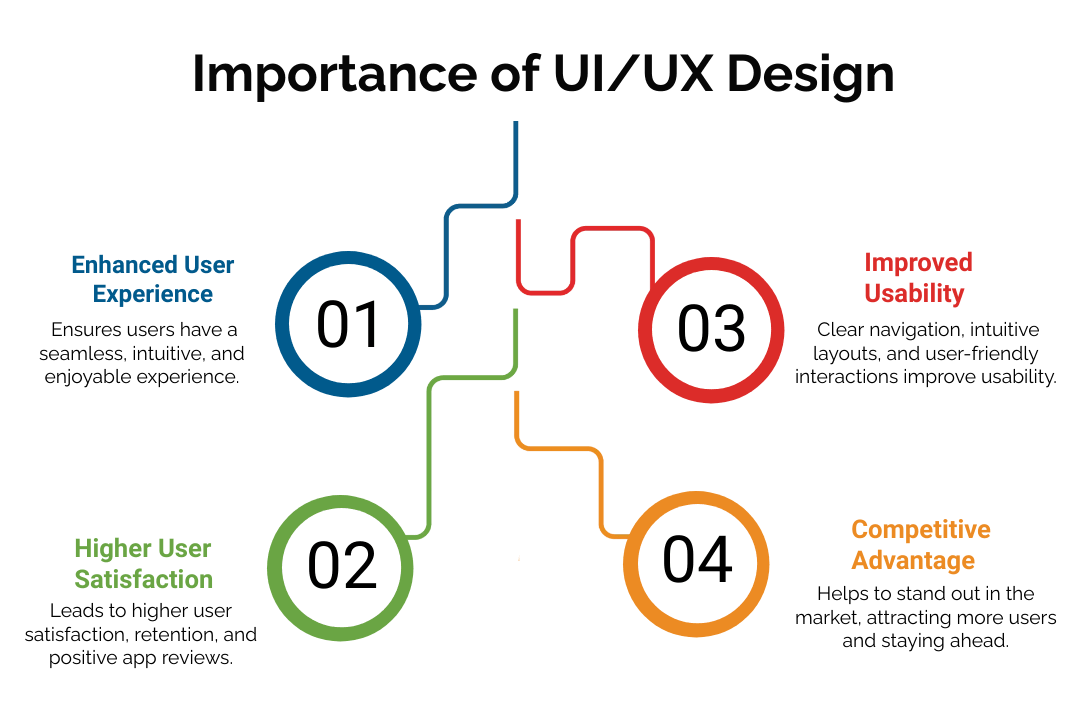
The UI/UX design plays an important role in your app designing. A well-designed UI/UX ensures users can navigate the app effortlessly. Clear layouts, intuitive interactions, and a focus on user flow let users easily achieve their tasks within the app, resulting in a more efficient and enjoyable user experience.
Example: Simple
The popular mobile banking app Simple’s UI/UX design focuses on minimalism, ease of use, and user financial empowerment.
The app features a clean interface with simple navigation, personalised insights, and interactive budgeting tools. Its straightforward and intuitive design allows users to track expenses easily, manage their finances, and set financial goals.
4. Animations and Microinteractions: The Power of Motion
Animations and microinteractions enhance user engagement, improve usability, and create delightful user experiences. Animations add fluidity, interactivity, and visual feedback to app interactions, making them more intuitive and engaging for users.
Microinteractions, on the other hand, are subtle interactive elements that provide immediate feedback or response to user actions, such as form submissions, navigation gestures or button clicks.
Incorporating animations and microinteractions into app design makes the app appealing and helps users understand app functionalities, navigate seamlessly, and stay engaged.
| Do’s and Don’ts of Animations and Microinteractions | |
| Do’s | Don’ts |
| Ensure they Serves a Clear Purpose | Use Animations Purely for Aesthetics |
| Opt for Subtle and Well-Timed Animations | Overdo Animations |
| Consider Users with Visual Impairments | Rely Solely on Animations to Communicate |
Example: Apple (Mobile OS)
Apple is a master of using animations and microinteractions to enhance the user experience in its mobile operating system, iOS. For example, subtle animations accompany actions like opening and closing apps, providing visual feedback that feels natural and intuitive.
App icons jiggle when entering edit mode, offering clear guidance on user interaction. Apple’s use of animations is always purposeful and unobtrusive and reinforces its user-friendly and innovative brand image.
5. User-Centric Design
User-centric design is an approach in mobile app development that prioritises users’ needs, preferences, and behaviours throughout the design process.
It involves understanding the target audience, empathising with their challenges, and creating solutions that enhance their overall experience. The user-centric design aims to create intuitive, engaging, and enjoyable app interfaces that effectively meet user expectations and fulfil their needs.
| Do’s and Don’ts of User-Centric Design | |
| Do’s | Don’ts |
| Conduct thorough user research | Ignore or dismiss user feedback |
| Develop detailed user personas | Assume user behaviour without research and testing |
| Iterate on design based on user feedback | Neglect accessibility considerations |
Example: Airbnb
Airbnb, the popular home-sharing platform, is a prime example of user-centric design in action. They continuously conduct user research to understand the needs of both hosts and guests.
The platform’s user-friendly interface allows for easy searching, booking, and communication, addressing the core needs of both parties.
6. Brand Visibility and Recognition
In the crowded mobile app market, brand visibility and recognition are king. They act as magnets, impacting user acquisition and retention and encouraging users to download your app.
Brand visibility ensures that the app stands out in a crowded market, attracts attention, and generates interest among potential users. Strong UI/UX design that reflects your brand identity builds trust and memorability.
A well-designed app icon and consistent use of branding elements reinforce recognition. By prioritising brand presence, you give your app a fighting chance to stand out and be discovered by potential users.
| Do’s and Don’ts of Brand Visibility and Recognition | |
| Do’s | Don’ts |
| Ensure a consistent visual language throughout the app | Use a generic or uninspired visual style |
| Use Branding Elements Wisely | Oversaturate with Branding |
| Integrate brand-relevant content within the app | Create an app experience that contradicts your brand image |
Example: Instagram
Instagram’s iconic logo and consistent use of a minimalist aesthetic with a focus on high-quality visuals instantly convey its brand identity. Their app store optimisation focuses on relevant keywords like “photo sharing” and “social media,” ensuring discoverability.
Collaborations with influencers and engaging social media presence further amplify their brand visibility. By prioritising brand recognition, Instagram has become a household name in the social media world.
7. Cross-Platform Compatibility
In today’s diverse mobile landscape, cross-platform compatibility is a game-changer for app designers. It allows your app to function seamlessly across different operating systems, like iOS and Android.
| Why do you Need Cross-Platform Compatibility in Mobile App Designing? | |
| Reason | Benefit |
| Reach a Wider Audience | Significantly increase your app’s potential user base, leading to more downloads and engagement. |
| Cost-Effective Development | Potentially reduce development costs by writing code once and deploying it on multiple platforms, saving on resources needed for separate native app development for each platform. |
| Faster Time to Market | Launch your app on multiple platforms simultaneously or quickly deploy on additional platforms after an initial launch. This can get your app in front of users faster. |
| Consistent User Experience (UX) | Provide users with a recognizable and intuitive experience regardless of their device, fostering user satisfaction and reducing the learning curve. |
With the diversity of devices and platforms in the market, designing a mobile app that works seamlessly on iOS, Android, and other platforms is crucial for maximising user reach and engagement.
| Do’s and Don’ts of Cross-Platform Compatibility | |
| Do’s | Don’ts |
| Choose a reputable framework | Neglect developer training or support |
| Design Responsive Layouts | Neglect testing on different devices |
| Adhere to iOS and Android design guidelines for a natural user experience. | Create a generic design that feels out of place on any platform. |
Example: Spotify
Spotify is a prime example of a successful cross-platform app. They utilise React Native to create a single codebase that functions flawlessly on iOS and Android devices.
The core music streaming experience remains consistent across platforms while adhering to platform-specific design guidelines for a familiar user experience. This approach has allowed Spotify to reach a massive user base on a global scale.
8. Prioritise Security Aspect
In today’s digital world, security breaches, cyber threats, and data breaches are constant threats. For mobile app design, a focus on security is paramount. It builds user trust and protects sensitive user data, like login credentials and financial information.
Users are likelier to download and engage with an app they perceive as secure.
Therefore, implementing robust security measures, such as secure authentication methods, encryption, data storage protocols, and regular security updates, helps mitigate risks and prevent unauthorised access or malicious attacks.
This fosters a positive brand image and reduces the likelihood of security incidents that could damage reputation and lead to legal consequences.
| Do’s and Don’ts of Security Aspect | |
| Do’s | Don’ts |
| Implement Encryption | Avoid Hardcoding Secrets |
| Use Secure Authentication | Store Unnecessary Data |
| Secure Network Communication | Skip Security Testing |
Example: WhatsApp
WhatsApp prioritises user security with a strong focus on data protection. Messages are encrypted end-to-end, ensuring only the sender and receiver can access them.
Regular security updates address vulnerabilities, and WhatsApp is transparent about its data practices through a clear privacy policy. This commitment to security has made WhatsApp one of the most trusted messaging apps globally.
Beyond Basics: Pro Tips to Stand Out from the Crowd
While the above practices lay a solid foundation, consider these additional elements to make your app truly shine:
- Context-Oriented Design: Tailor the app’s interface and functionalities to adapt to user context, like location or time of day.
- Embrace the Dark Side: A well-designed dark mode can improve battery life and offer a more comfortable viewing experience in low-light environments.
- Dynamic UI: Personalise the app’s interface based on user preferences and data to provide a more tailored experience.
Points to Remember
|
Common Mistakes to Avoid
Avoiding common mistakes is crucial in mobile app design to ensure a positive user experience and app success. Here are some design mistakes to avoid in mobile app design:
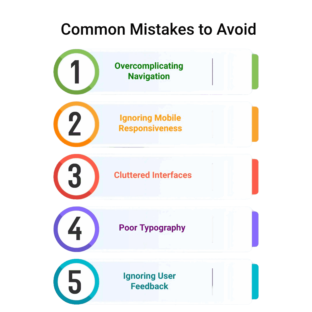
- Overcomplicating Navigation: Complex navigation structures or menus can make it challenging for users to find what they want. Keep navigation simple, intuitive, and easy to understand.
- Ignoring Mobile Responsiveness: Failing to optimise the app for various screen sizes, resolutions, and orientations can result in layout issues and poor user experience on different devices.
- Cluttered Interfaces: Crowded interfaces with too much information, buttons, or images can overwhelm users and detract from the app’s core functionalities. Prioritise simplicity and declutter the interface.
- Poor Typography: Small fonts, illegible text, or inadequate spacing can strain users’ eyes and make content difficult to read. Choose readable fonts, appropriate sizes, and proper spacing.
- Ignoring User Feedback: Neglecting user feedback and insights during the design process can result in missed opportunities for improvement and addressing user needs and preferences.
Additional Tips
|
To avoid these mistakes it is best to do the pre-research work before starting with your mobile app designing. Therefore, carefully examine each element and consider hiring the right mobile app developers who possess the experience and professionalism to handle your project.
However, you must also consider your budget before applying various elements to your app. Therefore, get insights about the cost of designing and developing mobile applications and the related pricing before proceeding with your app idea.
Conclusion
Designing a successful mobile app requires a comprehensive approach that incorporates best practices across various aspects, and a reliable mobile application development partner. By prioritising user experience, usability, accessibility, and engagement, you can create mobile applications that resonate with users, deliver value, and stand out in a competitive market.
It’s essential to continuously iterate, test, gather user feedback, and adapt to evolving user needs and technological advancements to ensure the app’s relevance, success, and positive impact on users’ lives.


