


Do you know the secret to capturing user attention and making them stay on your website? How to captivate the user’s minds and convince them to stay and convert?
If you are wondering the same, I have something to ask from you.
Have you ever heard of psychology-based website designing?
Yes! Psychology in Web Designing. A study on the 10-second rule says that users have little to zero patience to stay on a slow-loading or unimpressive website. These 10 seconds is all you have to display your business’s value proposition to gain your potential customers’ attention.
The colour, text, images, graphical patterns; a perfect blend of all these elements matters when creating a website.
In recent times, designers have been integrating human-centric approaches and leveraging website user psychology to enhance user experience significantly. This means that all the elements’ positioning should correlate with human behaviour, needs, and emotions to develop a meaningful and impactful website.
The concept of the psychology of web design is complex. However, in this blog we’ll cater to all your doubts to develop a highly conversant website design. We’ll explore how human psychology shapes web design principles and why understanding these psychological factors is essential for creating a compelling and user-friendly website.
So, let’s begin this informative and substantial journey.
What is the Psychology of Web Design?
The internet is a bustling landscape of websites and web applications vying for our attention. With countless options on the users’ fingerprints, why would they choose to stay on one website and leave another in a matter of seconds? The answer lies in the psychology of web design.
| Do you Know!
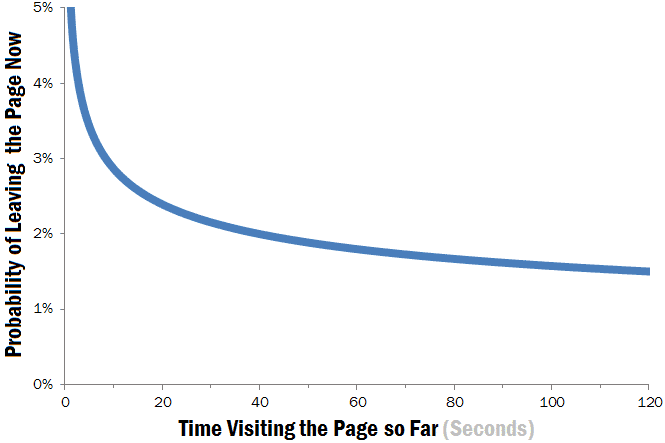
A user spends an average of 2.66 seconds to scan a website and decide to stay or leave. Therefore, you have a tiny window to display your offerings and capture the user’s interest. |
| The chart below clearly conveys that the first 10 seconds are critical for a user to decide between continuing or discontinuing with the website.
|
So, what is web psychology all about?
The psychology of web design caters to how human psychology and behaviour influence website designs and user experience. It involves understanding how users think, perceive, and interact with your website. It also defines how the developers can use their insights to develop a website catering to the end-users’ cognitive and emotional needs.
Therefore, understanding the principles of psychology can help web designers create websites that are more engaging, user-friendly and effective in achieving their unified goals.
Key Aspects of Psychology of Web Design
Incorporating psychological principles of web design aims to create a website that looks visually appealing, increases engagement, facilitates navigation, and achieves its intended objective, whether to inform, sell, entertain, or interact with users.
The significant aspects of the designing or redesigning your website using web psychology are:
- User Behavior and Perception – Understanding how users navigate websites, what catches their attention, and how they interpret and respond to various design elements is fundamental to web design. This includes studying eye-tracking patterns, scrolling behaviours, and click-through rates.
- Visual Hierarchy – Web designers use visual hierarchy to guide users’ attention to the most essential content on a page. This involves manipulating elements like size, colour, contrast, and positioning to prioritise certain information.
- Colour Psychology – Colors can evoke specific emotions and influence user behaviour. Web designers select colour schemes that align with the message and branding of a website, aiming to develop desired emotional responses in users.
- Cognitive Load – Websites should aim to reduce cognitive load, which is about the mental effort required to process information. Simple navigation, concise content, and logical layouts help users quickly find information and complete tasks.
- Readability – Typography and text formatting are crucial in making content readable. Designers choose fonts, font sizes, line spacing, and other text elements to enhance the legibility of the content.
What are the principles of the Psychology of Web Design?
Once you get a fair knowledge of web psychology and its key aspects, it’s time to get into detail about the primary principles of web design psychology.
1. Hick’s Law in UX Design
Hick’s Law, also known as the Hick-Hyman Law, is a psychological principle you can apply to your web design. It means that the more choices or options a person has, the longer it takes for them to make a decision
As per the Hick’s Law, the time it takes for a person to decide increases with the number of choices given to him. The law further explains that presenting users with too many options can lead to confusion, decision fatigue, and slow decision-making, potentially resulting in a paradox of choice which leads to users abandoning the website.
Google sets the best example of Hick’s law. Google keeps its landing page simple, focused and precise, with just a single search bar for taking the exact action for entering search queries. This minimalistic approach of Google emphasises efficiency and quick decision-making.
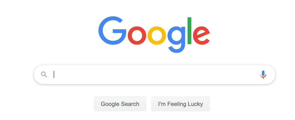
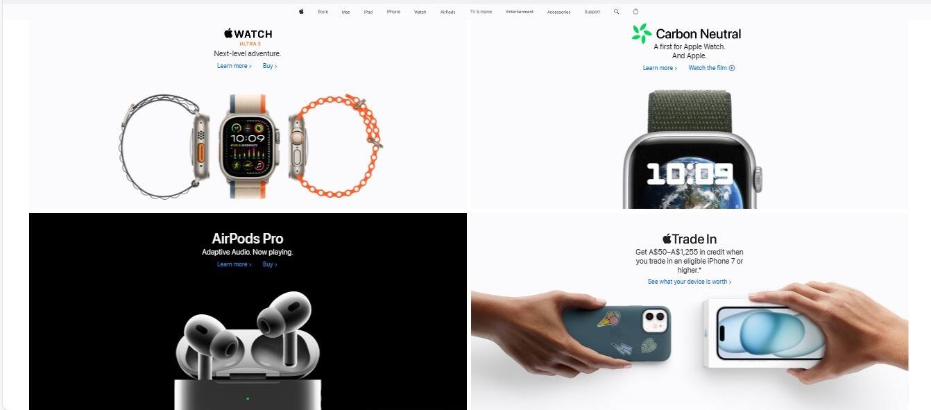
| Simplicity is their Secret!
Apple, Amazon, Netflix, Dropbox and many other companies follow Hick’s Law to highlight their key features, products and services without offering too many options to the users in one go. They use a simplified, minimalistic website layout with a focused call to action button or search bar. |
Hick’s Law states that the maximum user’s attention comes from simplicity, clarity, single point of focus, and user-friendly design in web interfaces. Reducing the cognitive load associated with decision-making and presenting the options meaningfully and straightforwardly leads to a smoother and more enjoyable user experience.
2. F-Pattern and Z-Pattern Psychology Design
The F-Pattern and Z-Pattern are two common eye-tracking patterns users tend to follow when reading or scanning content on a web page. Understanding these patterns is essential for adhering to the website design psychology. It allows designers to present content that aligns with how users naturally consume information.
F-Pattern
The F-Pattern is named after its shape, which resembles the letter “F.” It is mainly used for websites that contain heavy text or videos.
In F-Pattern, users start at the top of the page and read horizontally across the content and then move their gaze slightly down the page and read across again, making two horizontal lines of F.
Finally, users make a shorter vertical scan down the content’s left side, usually looking for points of interest or critical information.
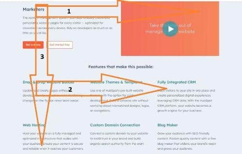
| HubSpot, a marketing and sales software company, uses the F-Pattern for its homepage and product pages. Important headings and CTAs are positioned at the top, guiding users to explore more as they scroll
|
Z-Pattern
This pattern is again named after the shape it forms, which resembles the letter “Z.” This pattern is instrumental in websites containing low-level text content.
In Z-Pattern, users typically begin scanning a web page from the top left corner and move horizontally to the right. They then move their gaze diagonally down to the left, forming the middle segment of the “Z.”
Finally, users continue with a second horizontal scan, moving from the diagonal scan to the right, completing the formation.
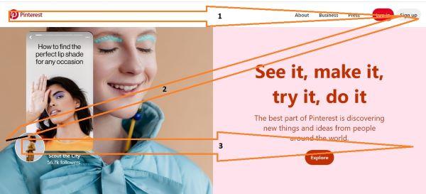
| Pinterest’s homepage features a straightforward Z-Pattern design. Users start at the top with the Pinterest logo and primary navigation, then move diagonally down the left side with visually engaging pins and user profiles. The second horizontal scan may include more pins and recommendations.
|
3. Fitts’ Law of Psychology of Web Design
Fitts’s Law is a psychological principle that has implications for web design, particularly in designing user interfaces and interactive elements. It describes the relationship between the target sizes, the distance, and the time it takes to navigate and select the target.
Fitts’s Law is particularly relevant for designing user-friendly interface navigation elements on websites and web applications.
To explain further, Fitts’s Law states that larger clickable targets are easier to click accurately and quickly. Designers often make important interactive elements, like CTA buttons or links, larger to make them more user-friendly.
In the example below, Enterprise Monkey’s company website emphasises clarity and simplicity. It features large, clickable elements, such as product images and buttons, that are easy to select, even on touchscreen devices. This aligns with Fitts’s Law principles for making targets larger and more accessible.
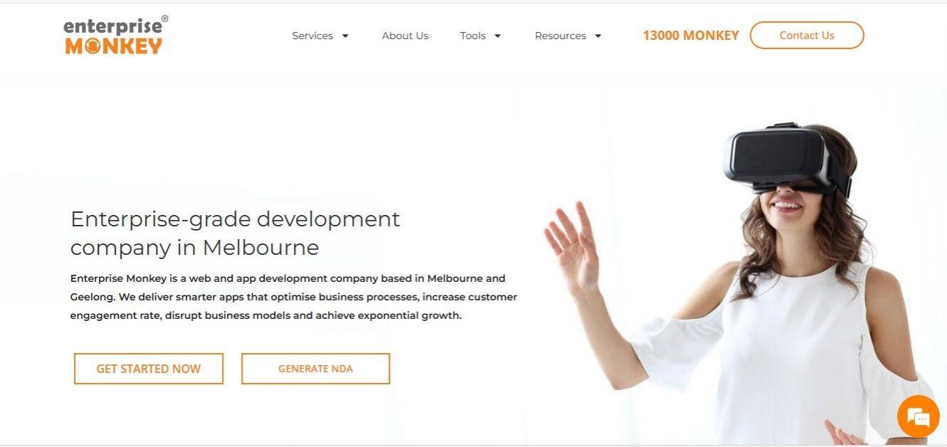
[Source: Enterprise Monkey]
4. Gestalt Principle of Web Design
The Gestalt principles are a set of psychological principles that explain how people perceive and organise visual information. These principles are often applied to web design to create aesthetically pleasing, user-friendly, and effective websites. They help designers understand how users perceive and interact with the elements on a web page.
Some fundamental principles of Gestalt principles are listed below:
- Closure: The closure principle suggests that people tend to mentally complete incomplete or fragmented visual elements to create a whole, recognisable figure.
Nike’s website often features large, eye-catching product images. This use of the principle of closure encourages users to click through to explore product details, creating an engaging and visually appealing experience. 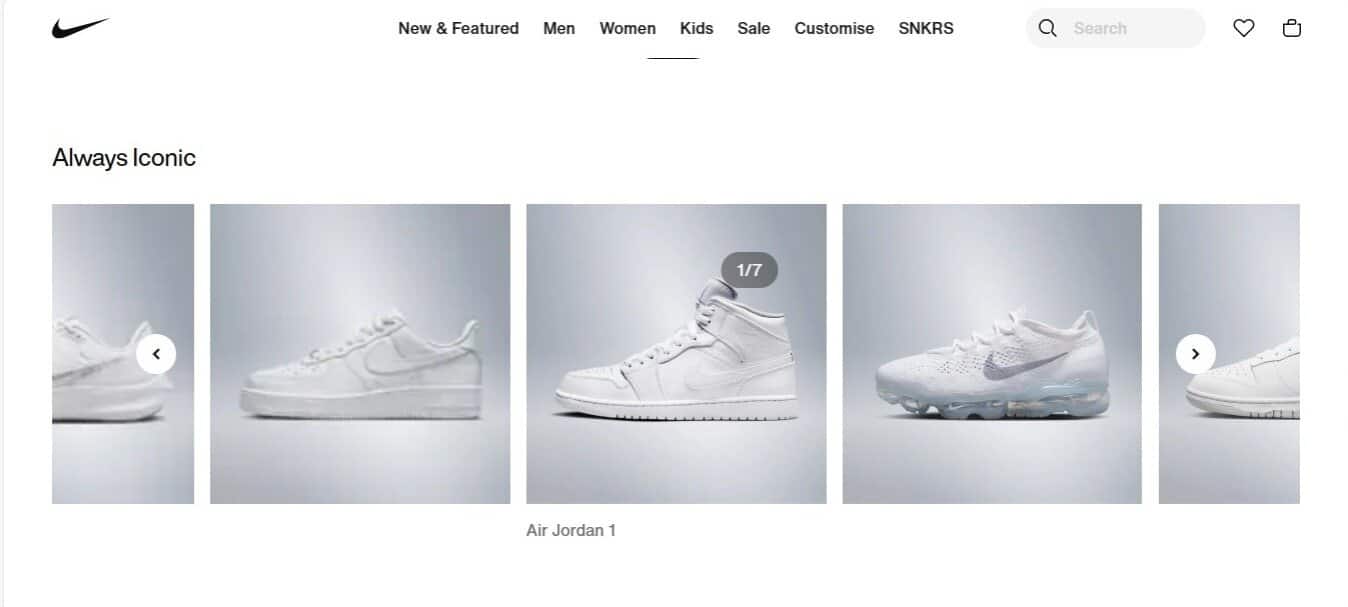
[Source: Nike]
- Proximity: The proximity principle highlights that objects placed close to each other are perceived as a group or related, even if they differ in shape or colour.
Apple’s website and product design often incorporate the principle of proximity by grouping related elements together.
[Source: Apple]
- Similarity: The similarity principle states that objects with similar visual characteristics, like colour, shape, or size, are perceived as part of the same group.
Amazon uses the principle of similarity by presenting related products in a grid format with similar layouts and imagery. This makes it easy for users to compare products at a glance. 
[Source: Amazon]
- Continuity: The continuity principle suggests that people perceive continuous and smooth patterns as single entities.Facebook’s use of the principle of continuity can be seen in the design of its news feed. Posts are presented in a continuous, flowing format, creating a seamless reading experience.
- Figure-Ground: This principle addresses the perception of an object (the “figure”) in relation to its background (the “ground”).
Airbnb’s listings for accommodations feature property images as the central figure, presented against a neutral backdrop. This design choice helps users focus on the property and its details. 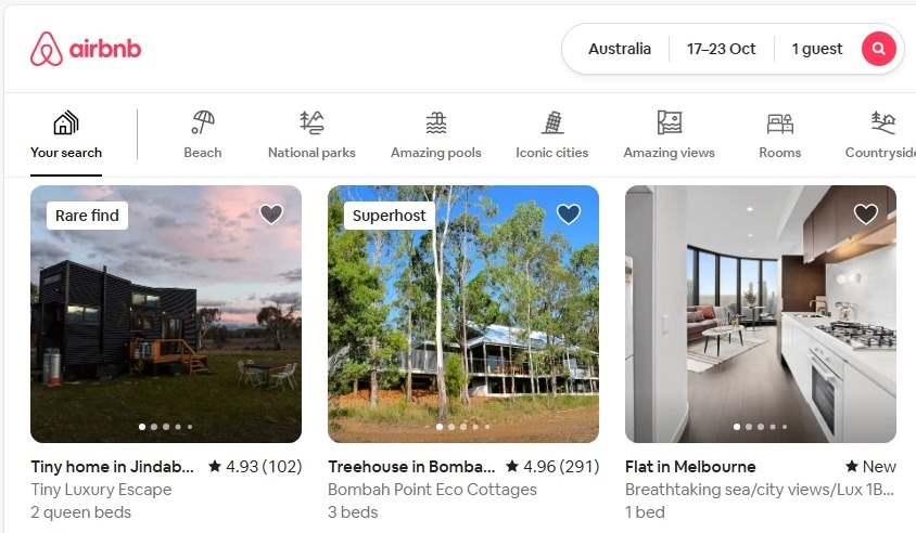
[Source: Airbnb]
- Common Fate: The common fate principle implies that elements moving in the same direction are perceived as part of the same group.Spotify uses the principle of common fate by animating playlist covers and elements on its music player. This visual feedback provides users with a sense of control and interactivity.
- Prägnanz (Good Continuation): Prägnanz is the principle of “good form” or simplicity. It suggests that people perceive the simplest, most organised forms when faced with complex visual information.Google’s homepage is a prime example of the principle of simplicity. The interface has a clean, white background with a single search bar, providing a straightforward and uncluttered user experience.
5. Principle of Visual Hierarchy
The principle of visual hierarchy is a fundamental concept in design, including web design, that involves arranging and presenting visual elements to convey their relative importance or order of significance.
It guides the viewer’s eye to understand the content and structure of a design intuitively. In web design, visual hierarchy is critical in helping users navigate, comprehend, and engage with a website’s content.
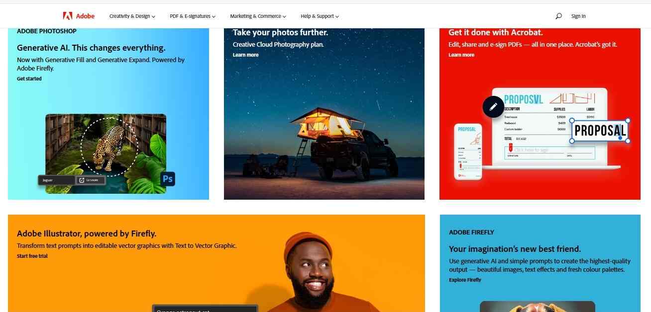
[Source: Adobe]
Adobe website sets an explicit example of visual hierarchy principle. Here, if you observe the website homepage, it showcases its software products with a clear visual hierarchy. The primary focus is on product names, accompanied by compelling images and feature highlights. This helps users quickly understand what each software product offers.
Therefore, visual hierarchy lets you emphasise specific elements or content on a web page. For example, a headline, a call-to-action button, or a critical piece of information can be more prominent to draw the user’s attention. This is often achieved through techniques like larger text, bold fonts, contrasting colours, or positioning.
6. Occam’s Razor Principle
Occam’s Razor, also known as the law of parsimony, is a fundamental principle in philosophy and science that suggests that the simplest design should be preferred among competing explanations or hypotheses.
| Dropbox’s website employs Occam’s Razor by presenting its cloud storage and file-sharing services clearly and uncomplicatedly. The design emphasizes key features, pricing, and a call to action to encourage sign-ups.
[Source: Dropbox] |
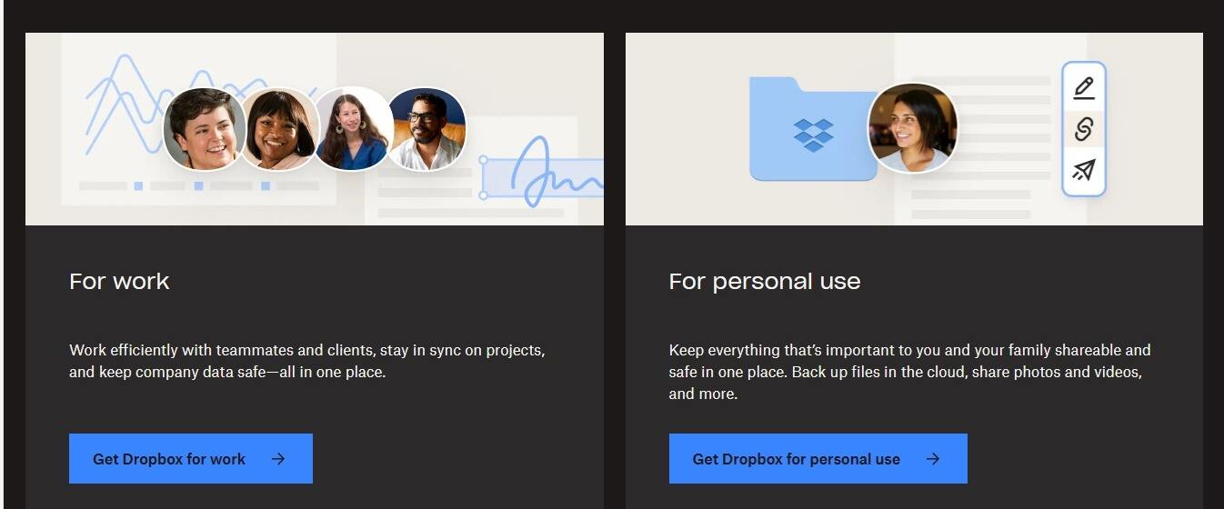
In the context of web design and user experience, Occam’s Razor can be applied as a guiding principle to create straightforward and efficient websites. The psychology of web design relates to Occam’s Razor principles in the following ways:
- Aesthetic Design: While aesthetics are essential, Occam’s Razor suggests that designers should aim for simplicity and elegance rather than excessive ornamentation.
- Clarity: Complex or convoluted design elements, excessive features, or unnecessarily over complicated language can confuse users and hinder their ability to find what they want.
- Efficiency: Occam’s Razor encourages the removal of unnecessary elements to streamline the user experience by minimising the number of clicks required to reach a goal and simplifying processes to provide user satisfaction.
7. The Zeigarnik Effect
The Zeigarnik Effect is a psychological principle that describes the tendency of people to remember uncompleted or interrupted tasks better than completed tasks. In the context of web design psychology, the Zeigarnik Effect can be a valuable concept to understand, especially when designing user interfaces and experiences.
Designers can leverage the Zeigarnik Effect to encourage user engagement. For example, suppose a user starts the checkout process but doesn’t complete it. In that case, the website can send a reminder email or display a notification when the user logs in, reminding them to finish their purchase.

[Source: Observer]
Let’s take an example of Fitbit website. You can see how skillfully Fitbit leverages the Zeigarnik Effect by encouraging users to complete their daily activity goals. The device sends reminders to users to reach their step or exercise targets, motivating them to stay active and engaged.
Allowing users to save drafts of content, such as blog posts or form entries, acknowledges the Zeigarnik Effect. Users can return to the site later to complete or revise their work as they understand an ongoing task.
8. The Von Restorff Effect
The Von Restorff Effect, also known as the isolation effect or the distinctiveness principle, is a psychological phenomenon that suggests that when multiple items or elements are presented together, an item that is noticeably different or distinct from others is more likely to be remembered and stand out in a person’s memory.
In the context of web design psychology, the Von Restorff Effect has implications for how designers can make certain elements or information more memorable and attention-grabbing.
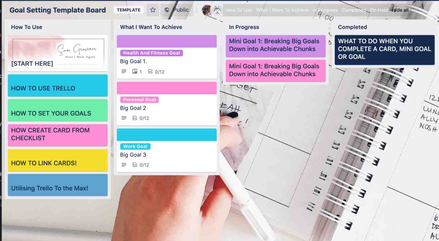
| Trello, a project management tool, uses coloured cards and labels to make important tasks and information stand out within boards. The distinct colours help users quickly identify and prioritize key tasks.
[Source: Trello] |
To simplify this concept, we can understand it in this way:
- Visual Contrast: Web designers can leverage the Von Restorff Effect by creating visual contrast between the background and foreground elements. This can help important content, such as headlines or product images, stand out more effectively.
- Guiding Users: Navigation menus and calls to action (CTAs) elements like “Sign Up” or “Buy Now” can be made distinct to encourage user interaction and guide them toward specific actions.
How to Use 5 Elements of Psychology of Web Design?
Your website is the first checkpoint for your customers to connect with you. Your website creates a first impression in the users’ minds. If it goes wrong, this first impression may lead potential customers to abandon your site and increase the bounce rate.
To avoid this scenario, you must pair the five major elements of the psychology of web design to influence the audience to visit your website and take the required action. Let’s take a quick look at these five elements below:
- Colour
Colour is a crucial element in web design, significantly impacting user psychology and behaviour. The choice of colours can influence how users perceive a website, evoke emotions, convey information, and guide user actions. - Layout
The layout establishes a visual hierarchy that guides users’ attention. How content and elements are arranged on a webpage can impact how users perceive, navigate, and interact with the site. The layout guides users toward their goals, facilitates content consumption, and ultimately leads to successful interactions on the website. - Spacing
Spacing elements, such as margins, padding, line height, and white space, play a crucial role in web design psychology. How these spacing elements are utilised can significantly influence user psychology and behaviour on a website. - Shapes
Incorporating shapes thoughtfully in web design can enhance user engagement, convey brand identity, and create a visually appealing and user-friendly experience. The choice of shapes should align with the website’s goals, target audience, and intended emotional impact. - Typography
Incorporating typography effectively in web design can create a user-friendly and engaging website. The choice of typefaces, fonts, font sizes, spacing, and text formatting can influence how users perceive a website, interpret its content, and engage with it.
By understanding these five elements of custom web design psychology and incorporating them into your design process, you can create more user-centric, efficient, and engaging websites.
Conclusion
The psychology of web design is a rich and multifaceted field that merges artistic creativity with human behaviour and cognition. Understanding these psychological principles enables designers to create visually appealing websites, engage users, facilitate navigation, and fulfil their intended objectives.
It’s a journey into the user’s mind, where the art and science of web design influence every click, scroll, and conversion. To create a successful web presence, designers must master the psychology behind it.
An expert web design agency understands these vital points. Their knowledge, efficiency and expertise will help you provide the most desirable website for your business that aligns with your company goals while fitting into human psychology.